A climber gets stuck on a grade and has no idea why. SEND IT films the attempt, shows them what their body did the moment their fingers opened, and tells them what to try next. I designed it as a full system – until I realised nobody opens a desktop while standing at the wall.
You fall, and fall again, and nobody can tell you why
A climber stuck on a grade knows exactly one thing: that it did not work. They did not see themselves. They do not know whether the hip drifted, whether the foot was too high, or whether there simply was not enough left in the forearm. So they try again, the same way, and fall the same way. With nobody watching from the outside, the fifth attempt is identical to the first.
I built a system that knows everything about your climbing. Nobody opens it while sitting on the mat.
The moment the project changed direction
02 / 08
Act One – From System to App
I had a working system. It could not be used where people climb.
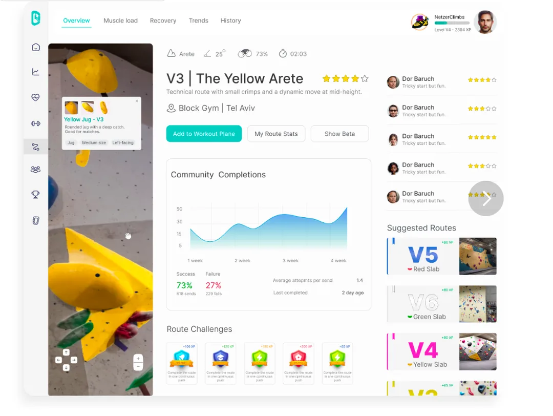
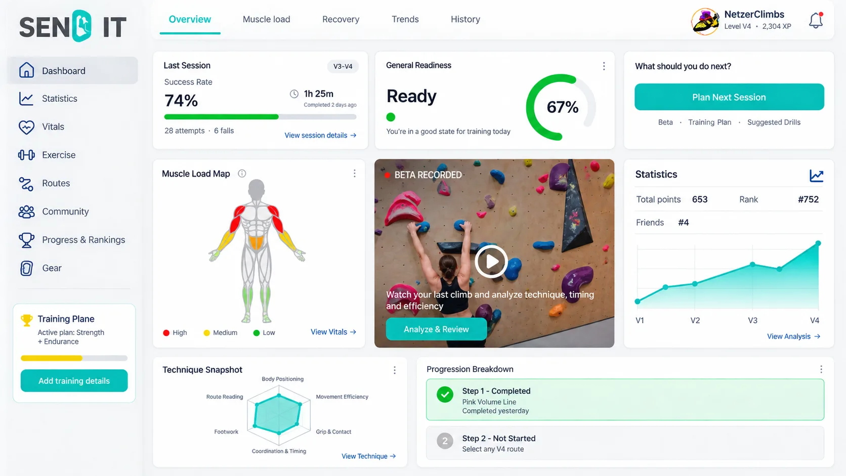
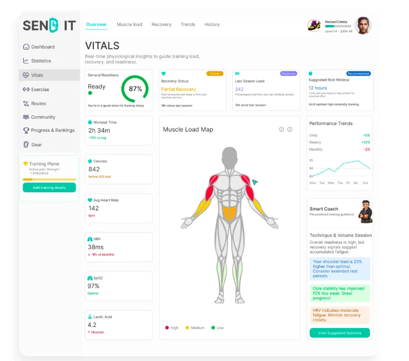
The first version of SEND IT was a desktop product called Performance Command Center – eight sections in a left rail, a nine-card grid on the home screen, HRV, SpO₂, lactic acid, a smart coach, a technique radar. It answered every question a climber might have. Its problem was not the answers. It was the room.
FIG.01The system I started with. Dashboard, Statistics, Vitals, Exercise, Routes, Community, Progress & Rankings, Gear – every question answered, on a screen the climber only reaches once they are home and the session is over.
01
I asked what, not when
I built a system that answers every question a climber could have. I never asked when they ask them. The answer is: standing at the wall with chalk on their hands – and that is exactly where a desktop does not exist.
Consequence: the product has to live where you fall, not where you summarise.
02
Nine sections is zero decisions
Eight rail items and nine home cards mean nothing was prioritised. When everything matters equally, the climber is the one who has to decide – and that is my job, not theirs.
Consequence: five tabs, and one primary action per screen.
What survived the move – and what it cost
From the system
Verdict
Why
Readiness score
Kept – promoted
It is the first thing a climber wants to know walking in, so it moved directly under the header on Home.
Muscle load map
Kept – given a job
On the dashboard it was looked at. In the app the loaded muscles choose the recovery exercises.
Beta, step by step
Kept – redrawn
The ten-step rail became annotation drawn on the climber's body, on the frame where the move failed.
Avatars, badges, tokens
Kept – relocated
Gamification got its own screen instead of sitting next to the username competing with a profile photo.
The route page with hold detail
Kept – became the centre
On desktop it was a column beside the data. In the app it became the surface you work on.
HRV · SpO₂ · heart rate · energy
Demoted
Moved from a headline dashboard card to a second layer inside the Body tab, behind a watch. They explain readiness; they do not replace it.
Lactic acid
Cut
The one reading with no equivalent on a watch a climber actually wears.
Calorie intake · macros · body weight
Never added
Calories burned stayed – they measure what you did. Weight measures what you are, and in a strength-to-weight sport that difference matters.
The eight-item left rail
Cut
Five tabs. Anything that did not deserve a tab went into a menu, not into a ninth rail item.
The nine-card home grid
Cut
Nine equal cards is nine unranked questions. Home became an ordered answer to one: what should I do right now?
“Plan Next Session” as a global CTA
Cut
A button that plans a session you have not had yet. Replaced by Scan a problem – the only thing you can actually do standing in a gym.
Setter tools · gym signage · marketplace seller side
Out of scope, stated openly
Real surfaces this product would need. Naming them protects the work in review far better than quietly omitting them.
03 / 08
Audience & Model
Designed for the climber who is stuck, not the one who is winning
Choosing the primary persona settled almost every argument that followed. A product for the climber who is improving can celebrate sends. A product for the climber who is stuck on a grade has to make failure legible, and has to stop treating a rest day as a lapse.
The projecting climber
Climbs V4, two or three sessions a week, eighteen months in. Owns a phone and no tripod. Has fallen on the same move six times today and cannot tell you why – not because they lack effort, but because nobody in the gym can see their own hips. They do not want to be told they failed. They want to be told what moved.
Primary User
“How the hell do I send this thing?”
Ofek AharoniV4 climber · 18 months in · Block Gym, Tel Aviv
Job 01 – mid-session
When I fall on the same move six times, I want to see what my body actually did, so I can change one thing instead of just trying harder.
Job 02 – walking in
When I arrive at the gym, I want to know whether today is a session or a rest day, before I have warmed up and committed.
Job 03 – walking out
When I finish, I want one number that moved, and I want to trust that it moved for a reason I agree with.
04 / 08
Process
Audit, then wireframe, then pixels – and audit all three
The lo-fi set was not a sketch of the hi-fi set. It was where the product got three of its hardest ideas wrong in public, cheaply, and where they got fixed.
01 – Audit02 – Lo-fi03 – Hi-fi
FIG.02Vitals, before. HRV, SpO₂, lactic acid, calories, average heart rate – five readings, and not one of them changes what a climber does next.
Round 00 – the diagnosis
Nine findings, and only two were about looks
Seven of the nine findings were not about how a screen looked, but about what it did. That is why the answer was a different platform rather than a restyle. The structural seven:
The product only ever meets the climber after the session ends
Eight rail items, no priority – depth in place of a decision
A primary button that plans a session you have not had yet
One score doing four incompatible jobs
Readings a climber cannot act on, presented as insight
A fall is counted nowhere – only what worked
The wall photograph sits in a side panel, next to the data instead of under it
Lo-fi, rounds 01–06 – home · the hands-free standby screen · the phone-refereed challenge. The last two did not survive.
9:41▲ ▮
Netzer · 1408 · V4 ▸
Block Gym · Tel Aviv · profile, settings and store
Goal this week
Send 3 V4 problems
0 of 3
~67
Readiness · estimated
3 days rest · slept 6 h · ate 4 h ago
Today's challenge
Silent feet on any V3
Refereed by the phone
Scan a problem to start
Film a friend instead
Climb
Problems
Progress
Community
Body
9:47▲ ▮
◉Watching
Recording starts when you leave the ground
V4 · The Yellow Arete
No attempts yet today
Power saving · 2 h 10 m left
Screen dims between attempts · capture stays at full rate
Stop watching
Everything here is sized to be read from the wall, four metres away. Nobody is holding
this phone, and it has to survive a two-hour session.
10:31▲ ▮
4 / 5Silent feet
One noisy placement on move 3
Refereed from audio and pose together
Pose says when and which foot lands, audio says how loudly
Moves 1, 2, 4, 5
quiet
Move 3 · right foot
noisy
+26 XP
Challenges pay whether or not you send
Go again — best of the day is 4
Rounds 01–06 – 30 screens, wireframe fidelity
Three good ideas that turned out to be wrong
Lo-fi is where you get to be wrong for free. All three of these survived six audit rounds and were killed on the way to hi-fi – each one because it promised something the product could not actually deliver.
A standby screen for hands-free capture. An elaborate solution to a non-problem: the climber presses the button standing next to the phone, before they climb.
“Who is in frame” as its own screen. A real concern, but it is one control, not a surface. It became a chip on the recorder.
A challenge refereed by the phone. Silent feet, judged from microphone and pose, with a waveform as evidence. A promise the product cannot keep.
Hi-fi, round 16 – the same three, resolved. Standby became a shutter you press before you climb. The referee became an honour system that says so out loud.
9:41
N
Block Gym
Rating 1408V4·
2,576 XP
~67
Readiness · estimated
3 days rest · slept 6 h · ate 4 h ago
Goal this week
Send 3 V4 problems
0 of 3
Today's challenge
Silent feet on any V3
Last session
3 days ago
6 problems · 3 sent · 34 attempts
Improvement
1 w1 m3 m6 m1 y
Rises on sends only
All stats
Scan a problem
Climb
Problems
Progress
Community
Body
9:47
REC
NTracking you
0:24
Recording · V4 Red Slab
Stop
10:31
4 / 5Silent feet
V3 · the blue traverse, 10:24
You scored this one
Nobody is listening. Mark it honestly or it measures nothing.
Quiet placements
012345
Which one got away · optional
12345Skip
Third session running
Counted per session, not per day — rest days never break it
Footwork · your weakest axis
Pyramid
Unchanged for 6 sessions · this is the challenge that targets it
+26 XP · 5 of 5 pays 40
Challenges pay whether or not you send
Go again — best today is 4
All challenges
Done for today
Rounds 07–16 · hi-fi
Three decisions that turned wireframes into a product
In lo-fi every screen was boxes and hierarchy. This stage settled where the photograph sits, where the explanation sits, and where colour is allowed to appear at all.
The photograph went from thumbnail to the centre of the screen. The problem page stopped being a list of data with a picture beside it and became a viewer over the wall – pan, zoom, tap a hold.
The explanation moved off the caption and onto the body. Instead of instructions under the frame, a teal skeleton drawn on the climber's limbs, on the move that failed.
Teal shrank to interaction only. It had been data, celebration and decoration as well. Now it is buttons, the active tab and the pose overlay – and that is what made 34 screens read as one product.
05 / 08
Key Decisions
Six arguments that happened, and how each one ended
Each of these was a live disagreement during the work, not a rationale written afterwards. Each one names what was killed, because a decision you cannot name the loser of is not a decision. The colour of every card matches the colour of the screen it lives on, in the strip below. A dozen smaller calls were made the same way, and each one is annotated on the screen it belongs to.
01
The result opens where you tapped
Killed: A separate Analysing screen, then a result screen, then an analysis screen – three screens for one outcome.
The three collapsed into one screen with a popover. Then the popover turned out to be rendering over a different screen from the one the button lived on – which is simply wrong. Screen 08 is now the same screen as 07, exactly; the only difference between them is the popover sitting on top.
A popover is a layer over the context it came from, not a navigation destination.
Layer, not destination
02
Two branches, one pattern
Killed: A full inverted dark screen for the send – a different shape of moment, given a different shape of screen.
A fall raises the analysis popover; a send raises the SENT popover with a Lottie. Exactly the same pattern for both branches. Breaking the palette for the celebration was given up in exchange for a consistent rule, and the animation carries the drama instead of the colour.
Consistency is worth more than one spectacular moment.
Consistency over spectacle
03
Honest self-report beat automatic judging
Killed: “Silent feet” judged from microphone and pose, with a waveform shown as evidence.
It was a promise the product cannot keep. A bad measurement makes the climber argue with the score instead of working on their feet. Now the climber reports: nobody is listening – mark it honestly or it measures nothing. It forced a second decision: a self-reported challenge cannot feed leaderboards, so it stays personal, and the boards count only what the gym can verify. Without that, the honour system is a competitive exploit.
An honest system with a stated hole beats a dishonest one that looks sealed.
Honesty over automation
01
9:54
How did it go?
Attempt 1 · 38 s · V4 Red Slab
38 s
Sent it
Fell at move
123456
Analyse the attempt
Next problem
Move 4
Fell at the dynamic reach
Attempt 1 · 38 s
+6 XP · 38 s on the wall
Forearms and shoulders loaded. Climbing rating unchanged.
~40 kcal burned
Estimated · connect a watch for heart rate
Community comparison queued · no signal, syncs later
See the breakdown
Go again
SCREEN 08The result opens where you tapped
02
10:12
How did it go?
Attempt 6 · V4 Red Slab
Sent it
Fell at move
123456
Analyze attempt · ~20 s
Next problem
SENT
V4 · Red Slab
Attempt 6 · rated 1455, above you
Climbing rating 1408 → 1420
Your first send above your own rating in three weeks
The 21st climber at this gym to send it
Goal: 1 of 3 V4 problems this week
See the breakdown
Publish as beta
Next problem
SCREEN 11Two branches, one pattern
03
10:31
4 / 5Silent feet
V3 · the blue traverse, 10:24
You scored this one
Nobody is listening. Mark it honestly or it measures nothing.
Quiet placements
012345
Which one got away · optional
12345Skip
Third session running
Counted per session, not per day — rest days never break it
Footwork · your weakest axis
Pyramid
Unchanged for 6 sessions · this is the challenge that targets it
No light week since 22 September. This is where climbers get hurt.
Weekly load
Take a lighter week
Half the attempts, two grades below your limit, technique challenges instead of projects.
Silent feet on V2 · you score it
One touch, no readjusting · you score it
One session, not two · counted
Set a lighter week
Not now
A lighter week still earns XP and still counts toward challenges.
Climb
Problems
Progress
Community
Body
SCREEN 26Rest is prescribed, so nothing may punish it
06
9:40
Before you climb 15 seconds
How did you sleep?
2 h4 h6 h8 h9 h+
Or read it from your watch
When did you last eat?
<1 h2 h4 h6 h+
Timing only — nothing is counted or weighed
Sore anywhere?
ForearmsShouldersFingersNothing
Skin
RawThinFine
Often the real limit, not the muscles
Done — readiness ~67
Skip · we'll estimate from rest days alone
Climb
Problems
Progress
Community
Body
SCREEN 23Nutrition is timing, never quantity
Drag · scroll · arrow keys – FIG.03 the six screens, colour-matched to their card
04
A fall costs exactly what a send costs
Killed: Readiness modelled from completed climbs, the way a logbook models a session.
Screen 14 says it plainly: readiness fell 67 → 38, and all 34 attempts moved it, not only the 3 that worked. This is the line that separates the rating, which measures outcome, from the body, which measures load. The same position drives challenges: “60 attempts this week” makes failure pay directly.
Physiology does not care whether you topped out.
Load, not outcome
05
Rest is prescribed, so nothing may punish it
Killed: A daily streak – in a product that also holds a recovery plan, a deload week, and “rest as long as you need”.
An app that contradicts itself teaches people to ignore it. The streak counts sessions, not days – “third session running”, with copy saying explicitly that rest days do not break it. The deload week still earns XP and still advances challenges, so backing off never quietly costs you anything.
Never punish the thing you just prescribed.
No contradiction
06
Nutrition is timing, never quantity
Killed: Calorie counting, macros and body weight – the default vocabulary of every fitness product.
Check-in asks when you ate, not how much. No calorie counting, no macros and no body weight – anywhere in the product. Calories burned stay, because they measure what you did, not what you are. Climbing is a strength-to-weight sport with a documented eating-disorder problem, so this is a safety decision rather than a simplification. The recovery plan says “within two hours” – no number, nothing to count.
Some questions are cheap to ask and expensive to answer.
A safety decision
07 – Falling never costs you rating
The second version of the model deducted points for a failed attempt. It was tidy, and it was wrong: it penalised projecting – the single behaviour the product exists to encourage. The rating now moves on sends only and never falls. What a failed attempt does move sits in the other two numbers, and every screen explains the rules of the number it shows.
Number
What it means
What moves it
Climbing rating1408 → 1436 · V4
How well you climb. The only number that is about climbing.
Sends only. It never falls because an attempt failed – a fall is training, not a loss.
XP2,848
App currency. Says nothing about how well you climb, and it is a balance, not a level, so it never reads as a ladder.
Every attempt, every challenge, every published beta.
Readiness~38
Fatigue, not worth. The tilde stays even with a watch on – readiness is computed from measurements, it is not itself measured.
Every attempt, sent or not. All 34 moved it, not just the 3 that worked.
↑ Problems carry ratings too, so the problem is the opponent and gym grades calibrate themselves against real send data instead of a setter's opinion.
06 / 08
The Screens
Thirty-four screens, live – not pictures of screens
Everything below is the real interface, rendered in the page at 390 × 844 and scaled down. Each one says what it is for before it says why it looks that way – because that is the order the decisions were made in.
01 – 12
The session
Home to explanation. The climber presses the shutter standing next to the phone, climbs, comes back to one question – and then to the move that failed, drawn on the body.
9:41
N
Block Gym
Rating 1408V4·
2,576 XP
~67
Readiness · estimated
3 days rest · slept 6 h · ate 4 h ago
Goal this week
Send 3 V4 problems
0 of 3
Today's challenge
Silent feet on any V3
Last session
3 days ago
6 problems · 3 sent · 34 attempts
Improvement
1 w1 m3 m6 m1 y
Rises on sends only
All stats
Scan a problem
Climb
Problems
Progress
Community
Body
01
Home
See readiness, today's goal and your last session – then tap Scan a problem.
The order follows what a climber wants to know walking in: readiness first, because it decides how the session goes. Then the goal, then the clip from last session – you see yourself climbing, which is the emotional hook of the screen. The header is three layers: the app (menu, logo, photo), the place (avatar + gym name, centred together), and the state (rating, grade, XP). One primary action.
9:54
How did it go?
Attempt 1 · 38 s · V4 Red Slab
38 s
Sent it
Fell at move
123456
Analyse the attempt
Next problem
Move 4
Fell at the dynamic reach
Attempt 1 · 38 s
+6 XP · 38 s on the wall
Forearms and shoulders loaded. Climbing rating unchanged.
~40 kcal burned
Estimated · connect a watch for heart rate
Community comparison queued · no signal, syncs later
See the breakdown
Go again
08
The result – a popover over the same screen
Analyse raises the result in place, without leaving the screen you were on.
This is the same screen as 07, exactly; the only difference is the popover. The result opens where you tapped. It gives the bottom line – the move that failed, the XP, and “Climbing rating unchanged”, because a fall is training, not a loss.
9:56
Attempt
Beta breakdown
Step 4 of 6 · the dynamic reach
Hips further from the wall than at set-up
Next hold · up and right
Step 4 / 6
At the moment you launched
Hips higher and further from the wall than when you set up for the move. Neither foot
moved before the reach began.
Joint positions against the wall plane fixed when you placed the phone
Step 3
Step 5
Compare with the setter's beta
Climb
Problems
Progress
Community
Body
10
Beta, move by move
Step through the sequence, explained on the body, on the move that failed.
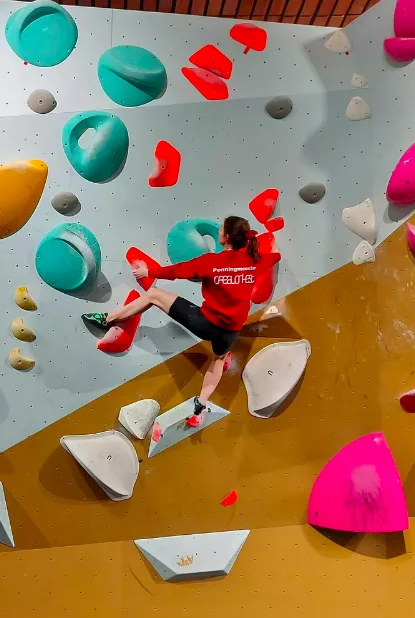
The explanation is drawn on the frame, not captioned beneath it: a teal skeleton tracing her limbs, a dashed cue toward the next hold, labels anchored to the joint they describe. That is how a person explains climbing – by pointing at the body. Same climb as the card on Home; one clip, two depths.
Swipe for more screens
9:42
Cancel
Scan the tag
Point at the QR on the problem
Hold steady
Before the camera opens
Everyone else in frame is blurred
Analysis runs on this phone
Publishing beta asks you separately
Got it
Shown once at Block Gym
02
Scan the tag
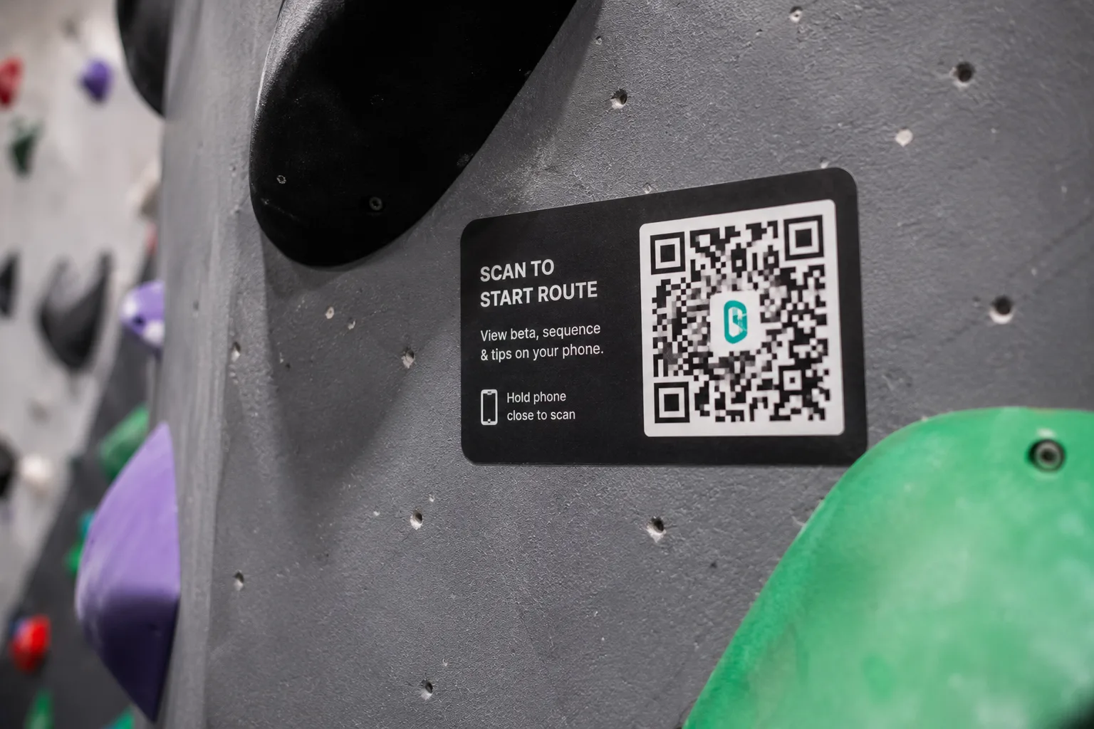
Point the camera at the QR on the wall and the problem opens.
The consent sheet appears here, once per gym: faces blurred, analysis on-device, publishing asked separately – three lines and a button. A privacy gate shown after the camera already ran is not a gate.
9:43
Scan
V4 · Red Slab
Rated 1455 · climbs hard for its grade
SlabVolumesSet 3 weeks ago
Drag to explore
Tap a hold
+−
31%
Send rate
4.8
Avg attempts
21
of 68 sent
DB
Beta · the setter's, plus 4 climbers
Fastest first · Dor B. is closest to your height
Record an attempt
Climb
Problems
Progress
Community
Body
03
The problem
Explore the wall on the photograph – pan, zoom, tap a hold – then Record an attempt.
The photograph is the screen, not a thumbnail beside it. Explicit + / − controls exist because chalked hands miss pinch targets. Community data – send rate, who sent it, published beta – lives inside the problem, because this is where the decision gets made.
9:43
Problem
Hold 3 of 6
+−
Red Pinch
Long pinch with a positive edge. Squeeze from either side.
PinchMedium sizeVertical
Previous hold
Next hold
Record an attempt
Climb
Problems
Progress
Community
Body
04
Hold detail
Tap a hold in the viewer and see it up close: name, type, size, orientation.
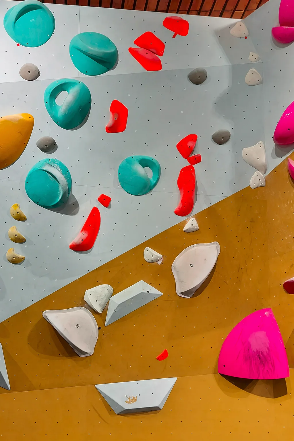
The close-up is a real crop of the same wall – the long red pinch in the middle of the line. A climber who reads “good for matches” before leaving the ground has already built half a sequence in their head. That is the whole job of this screen.
9:44
Frame the whole problem
Front camera · you see this while placing it
Whole problem in frame
Phone upright
Low light — brighter wall if you can
Start attempt
05
Place your phone
Set the phone down so the whole problem is in frame, then hit the shutter.
A full-bleed viewfinder, exactly like opening the phone's own camera. One centred instruction instead of an explainer card. The camera-flip control sits beside the shutter: front camera to watch yourself place it, rear camera to face the wall. A failing check still says what to fix.
9:47
REC
NTracking you
0:24
Recording · V4 Red Slab
Stop
06
Recording
The phone is down and rolling. Stop it on the way back.
The same viewfinder as screen 05 – only now it is live: REC, a timer big enough to read from the wall, a “who's in frame” chip you can change with one touch, and a round stop button. One control, zero decisions mid-climb.
9:52
How did it go?
Attempt 1 · 38 s · V4 Red Slab
38 s
Sent it
Fell at move
123456
Analyze attempt · ~20 s
Next problem
07
How did it go?
Mark a send or a fall, then choose: analyse now, or move to the next problem.
Shown only when the system cannot decide by itself – one honest question beats a guess that quietly corrupts everything downstream. Analysis runs in the background either way and waits in history, so there is no separate waiting screen anywhere in the flow.
9:55
Problem
Attempt 1 · V4 Red Slab
Fell at move 4 of 6 · 00:38
38 s
Auto-trimmed
What happened
Your hips came away from the wall before the dynamic reach.
Joint positions · scaled to your height
Try this next attempt
Rotate the right hip in and push from the left foot before you launch.
4 / 6
moves
38 s
on the wall
+6
XP
Break down the beta · move by move
Go again
Climb
Problems
Progress
Community
Body
09
Full breakdown
Opens from See the breakdown: the clip, what happened, what to try, the metrics.
The observation, the adjustment for the next attempt, and a metric row (moves, time on the wall, XP) that gives numbers without retelling the story. The primary action is the step-by-step beta – deliberately not called “Analyse”, because that word promises a wait that does not exist.
10:12
How did it go?
Attempt 6 · V4 Red Slab
Sent it
Fell at move
123456
Analyze attempt · ~20 s
Next problem
SENT
V4 · Red Slab
Attempt 6 · rated 1455, above you
Climbing rating 1408 → 1420
Your first send above your own rating in three weeks
The 21st climber at this gym to send it
Goal: 1 of 3 V4 problems this week
See the breakdown
Publish as beta
Next problem
11
SENT – a popover over the same screen
A send raises a celebratory popover over screen 07, with a teaser of the climb.
The other branch of “How did it go?”, in exactly the same pattern as the fall – a layer over where you tapped, not a new place. The teaser carries all three rewards at once: ability, belonging and commitment. “The 21st climber to send it”, not “rank 21”.
10:31
4 / 5Silent feet
V3 · the blue traverse, 10:24
You scored this one
Nobody is listening. Mark it honestly or it measures nothing.
Quiet placements
012345
Which one got away · optional
12345Skip
Third session running
Counted per session, not per day — rest days never break it
Footwork · your weakest axis
Pyramid
Unchanged for 6 sessions · this is the challenge that targets it
+26 XP · 5 of 5 pays 40
Challenges pay whether or not you send
Go again — best today is 4
All challenges
Done for today
12
Challenge
Report today's challenge honestly, and see where it accumulates.
Silent feet is a training game climbers already police themselves, and here it stays that way. The phone does not measure and does not judge – you heard your own feet, you report. The streak line says out loud that rest days do not break it, because a daily streak would punish rest. The XP ceiling is visible so there is something to aim at.
13 – 17
After the session
What the session did to your climbing, and what it did to your body – reported separately, because they are not the same measurement.
11:26
Session complete
1 h 45 m · 6 problems · 3 sent · 34 attempts
Goal complete
3 V4 problems
3 of 3
What changed today
Hip positioning improved from attempt 4 onward. Footwork unchanged for a sixth session.
1408→1436
Climbing rating
+272
XP earned
Grinder
Badge earned
~340 kcal burned this session
Estimated · connect a watch for heart rate
Recovery
Forearms heavily loaded · rest 2 days
Estimated from 34 attempts and 23 m on the wall
See your recovery plan
Set next week's goal
Climb
Problems
Progress
Community
Body
13
Session summary
See what the session did, and decide what comes next.
What changed in your climbing first; points second. The three axes report separately because they are not the same thing. Two closing actions, both facing forward: recover from this session, and set a goal for the next. That is what turns a report into a loop. And one vitals line for watch owners – calories and peak heart rate for the whole session, linking to Body. The same pattern as the popover after an attempt: bottom line here, depth in one place.
11:28
Body estimated · no watch
~38
Readiness
Low — heavy session, rest 2 days
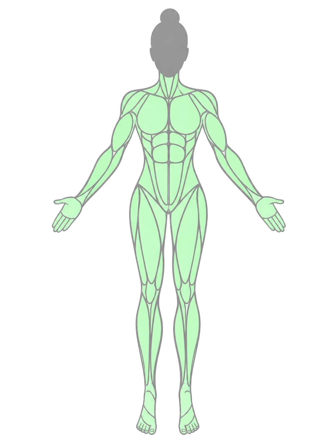
Muscle load map
Tap the figure for full readings
HighMediumLow
Exertion
~ high
Attempts
34 · 31 falls
Time on wall
23 m of 105 m
Energy used
~ 340 kcal
Heart rate · HRV
needs a watch
Connect a watch
Climb
Problems
Progress
Community
Body
14
Body – estimated
Check what the session cost your body, with no watch on.
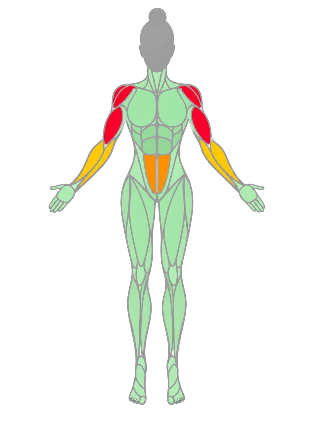
Readiness fell from 67 to 38. In this tab a fall and a send weigh exactly the same, which is physiologically correct – the forearm does not know whether you topped out. The load map goes from its resting state to loaded: red at the shoulders and arms, amber at the forearms and core. One figure, two states. The figure itself is the control – tapping it opens the full readings, because physiological metrics belong to the body, not to a dashboard card.
11:30
Progress
Climbing rating 1436 · V4
Your score as a climber. Built from verified sends, earned on the wall.
1298 → 1436 in six months · rises on sends · adjusts if a problem settles elsewhere · decays only after months away
XP balance 2,848
App currency. Says nothing about your climbing.
Spend it on avatars and frames
Capability
Weakest axis: footwork
Unchanged over 6 sessions · one challenge targets it
See the footwork challenge
Climb
Problems
Progress
Community
Body
16
Progress
Look at the two numbers and understand that they are not the same thing.
The chess.com rule: rating accrues only through play and cannot be bought. XP has a balance, not a level, precisely so it never reads as a ladder. Every card explains its own rules, because a scoring system nobody trusts is worse than no scoring at all. The hexagon carries exactly one teal accent, on the weakest axis.
Swipe for more screens
11:28
Body measured · watch connected
~41
Readiness · still an estimate
Low — built from measured HRV and a heavy session
Muscle load map
Tap the figure for full readings
Heart rateper problem
Exertion
~ high
Attempts
34 · 31 falls
Time on wall
23 m of 105 m
Energy used
~ 385 kcal
Peak heart rate
164 bpm
Watch data synced at 11:27
Climb
Problems
Progress
Community
Body
15
Body – measured
The identical screen, for someone wearing a watch.
The locked row opens to a real reading and readiness sharpens to 41 – but the tilde stays, because readiness is computed from measurements, it is not itself measured. Two data fidelities in one layout: the difference is a ring style and a tilde, not a different screen.
11:32
Progress
Your pyramid 6 months
1 m6 m1 yAll
The whole shape moved right
Your V3 base grew and V4 stopped being rare, while V4 is still your hardest grade.
Sessions
52
Problems sent
148
Attempts
1,604
Climbing rating
1298 → 1436
Climb
Problems
Progress
Community
Body
17
Send pyramid
See six months of progress even when your hardest grade has not moved.
A chart of your highest grade is a flat line, and a flat line discourages exactly the person who is stuck – the product's persona. The pyramid shows the base widening instead. 1,604 attempts are on the board, not only the 148 that worked.
18 – 22
Challenges & community
Four sources of challenge, beta from the setter and from climbers, and a league ranked by improvement rather than ability.
11:34
Progress
Challenges
AllDailyMineFriendsGym
Today · silent feet on any V3
Your best today 4 of 5 · everyone gets the same one
No matching hands · any V3
You score it · targets footwork
One touch — no readjusting
You score it
60 attempts this week · counted
Falls count · 34 so far, all from today
DB
Dor B. challenged you · counted
Red Slab in under 4 · you took 6
Block Gym · the cave wall
Send 5 of the 7 new problems · counted
Challenge a friend
Some challenges the app can count from your session. The rest run on your word — nobody is checking, and that is the point.
Climb
Problems
Progress
Community
Body
18
Challenges
Pick a challenge: daily, yours, a friend's, or the gym's.
Four sources, like a daily puzzle in chess. A weekly attempt count makes failure pay directly – today's 31 falls advanced it further than three clean sends would have. Self-reported challenges stay in personal territory and never feed the leaderboards, where only what the gym can verify is counted.
11:38
Problem
Beta · V4 Red Slab
The setter's send, plus 4 published by climbers
Setter
0:24
Amit L. · filmed when the problem was set
Ships with the problem from day one
Climbers 4 published
FastestClosest to my build
IK
Ilan K. · 0:31
1 attempt · 190 cm · reaches straight through
DB
Dor B. · 0:34
4 attempts · 181 cm · closest to your 178 cm
MS
Maya S. · 0:47
7 attempts · 172 cm · intermediate crimp
SK
Sarah K. · 0:52
6 attempts · 162 cm · adds a heel hook
Fastest is objective — but the fastest send here belongs to someone 12 cm taller, and their
sequence will not fit you. That is what the second sort is for.
Save a beta to this problem
Climb
Problems
Progress
Community
Body
20
Beta
Watch how other people sent it: the setter first, then climbers – fastest first.
The setter films themselves finishing the set, and that clip ships with the problem on day one, which kills the cold start. The second sort, “closest to my build”, exists because the fastest send here belongs to someone 12 cm taller and their sequence will not work for you. Height is captured at setup, so it costs nothing.
11:42
Block Gym 214 members
Autumn Boulder League
Open · 96 entered · 12th of 96 by improvement
Ranked by improvement this window
1D
Dana
+64
2A
Amit
+51
12N
You
+28
Rating gained inside the window, not rating itself — otherwise the strongest climber wins every time and nobody else enters.
New this week
7 problems set on the cave wall · 2 provisionally in your range
Friends · 4 climbing now
Climb
Problems
Progress
Community
Body
22
Community
See what is happening in your gym, and where you sit in the league.
12th of 96 in your gym moves something; eighty-four-thousandth in the world is noise. Leagues map onto competitions the gym already runs, and they carry no currency of their own – the league ranks by how much your rating rose inside the window, not by the rating itself. Otherwise the strongest climber wins every time and nobody else has a reason to enter.
Swipe for more screens
11:37
Problems
V3 · Green Slab
Set yesterday
V3 · Green Slab
Set yesterday · not yet rated
Starting from the setter's grade
7 climbers have tried it. The rating settles once about 30 have.
Sending it still counts
Your climbing rating updates against the provisional value, and is corrected if the problem
settles somewhere else.
Setter's beta is already here
Filmed the day it was set
Record an attempt
Gyms reset a wall every four to eight weeks, so this state is the common case.
Climb
Problems
Progress
Community
Body
19
Unrated problem
Understand why a fresh problem has no rating yet, and what that means for your send.
Gyms strip and reset every four to eight weeks, so “new problem” is the normal state, not an edge case. The rating starts from the setter's estimate and corrects itself retroactively as sends come in. The setter's beta is already here, so even a one-day-old problem has something to show.
11:40
Community
Leaderboards 1436 · V4
Your rangeThis problemFriendsLeague
Climbers rated 1336 to 1536
Block Gym · this month · ranked by rating gained
1DP
Dana P. · 1352
+71
2N
You · 1436
+58
3YR
Yael R. · 1498
+44
4AL
Amit L. · 1455
+21
Only climbers within 100 points appear. Ranked by rating gained, not rating held.
Watch the world's best · not a ranking
Climb
Problems
Progress
Community
Body
21
Leaderboards
Compare yourself with people who are actually like you.
Four boards, each answering a different question. The default is your own range, ranked by improvement – which is why Dana sits first at 1352 and Yael third at 1498, with you second at 1436. That is not ability order, and that is the point. The world's best sit behind a link that says outright it is not a ranking.
23 – 26
Readiness & recovery
Fifteen seconds of check-in, then a plan for now, tonight and tomorrow. Rest is prescribed here, so nothing elsewhere may punish it.
9:40
Before you climb 15 seconds
How did you sleep?
2 h4 h6 h8 h9 h+
Or read it from your watch
When did you last eat?
<1 h2 h4 h6 h+
Timing only — nothing is counted or weighed
Sore anywhere?
ForearmsShouldersFingersNothing
Skin
RawThinFine
Often the real limit, not the muscles
Done — readiness ~67
Skip · we'll estimate from rest days alone
Climb
Problems
Progress
Community
Body
23
Check-in
Answer four questions before you start – about fifteen seconds.
All chips: no typing, no search. Food asks when, never how much – an easier question and a more useful one. Skin is here because climbers genuinely track it, and it is often what ends a session. Pain feeds the injury map; sleep and skin come back in the recovery plan.
11:27
Summary
Recover after a heavy session
Forearms and shoulders took the load
Drawn from today's muscle load map
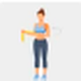
Forearm flexor stretch · 2 × 30 s
Now, before you cool down
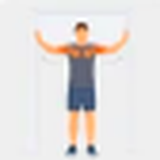
Doorway chest opener · 2 × 30 s
Antagonist to today's pulling
Wrist and finger mobility · 3 min
Tonight
Eat within two hours
Protein and carbohydrate together. No target, no counting.
Aim for 8 hours tonight
You slept 6 h and trained hard. Recovery is where the adaptation happens.
Skin
Fine this morning, 34 attempts since. Check the tips tomorrow.
Remind me at 22:30
Climb
Problems
Progress
Community
Body
24
Recovery plan
Get what to do now, tonight and tomorrow.
The load map finally does work instead of being looked at: the muscles that loaded are the ones that choose the exercises. Food says “within two hours” – no number and no counting. Sleep and skin return from the morning check-in, so all four questions are answered somewhere.
Mon 8:15
Three hard weeks in a row
No light week since 22 September. This is where climbers get hurt.
Weekly load
Take a lighter week
Half the attempts, two grades below your limit, technique challenges instead of projects.
Silent feet on V2 · you score it
One touch, no readjusting · you score it
One session, not two · counted
Set a lighter week
Not now
A lighter week still earns XP and still counts toward challenges.
Climb
Problems
Progress
Community
Body
26
Deload week
Get told that three heavy weeks have stacked up, and decide whether to back off.
A real training concept, detectable from data the product already collects. The last line is the whole point: a deload still earns XP and still advances challenges. A system that quietly punishes rest teaches climbers to ignore the very warning it just issued.
Swipe for more screens
11:29
Body
Body injuries and niggles
Tap any area to flag it
Left ring finger · active
Flagged by you 9 days ago · mild
Forearms · active
From this morning's check-in · normal soreness
Right elbow · resolved
Flagged 5 weeks ago
Load is climbing again on that finger
Crimp-heavy problems three sessions running. Consider open-hand grips this week.
Flag something new
You name the area and how it feels. It never names a structure or a diagnosis.
Climb
Problems
Progress
Community
Body
25
Injuries and pain
Mark an area that hurts, and track it over time.
Climbers already track fingers and elbows in their heads. Once the area is marked on a figure the product already owns, the system can warn when load returns to it – for the cost of exactly one new interaction.
27 – 29
Store & avatar
Sorted by what you need in the next ten minutes, and a home for the gamification so it stops competing with your identity.
11:44
Profile
Store at Block Gym
Search gear, brands, shoes
Here nowNearbyShipped
Available at the desk
Pick up in a minute, on your way out
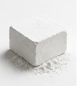
Chalk block · 56 g
₪35
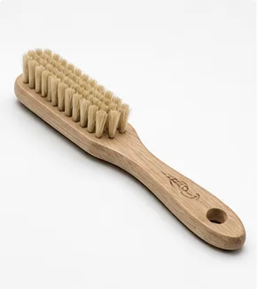
Brush · medium
₪28
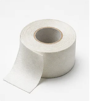
Finger tape
₪22
Your shoes have 48 sessions
Added to your kit in April. Resoling is due around 60, and costs a third of a new pair —
three shops near you do it.
Reserve these three at the desk
Cosmetics
Avatars, badges and frames · spend 2,848 XP
27
Store
Buy what you are missing right now, sorted by how fast you can hold it.
Sorted by availability rather than category, because you notice the chalk has run out while you are still at the gym. The shoe note counts sessions and points at a resole – the cheap answer. An earlier version derived the same note from a footwork score and pointed at a ₪720 purchase. That version was killed.
11:46
Store
Try on at the desk
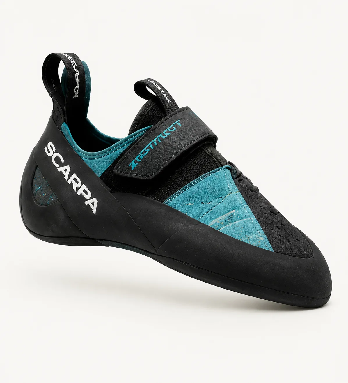
Scarpa Instinct VS
Downturned · synthetic · ₪720
In stock at Block Gym — try them on
Sizes 41 to 43 at the desk today
Climb Center Herzliya · 12 km
tomorrow
Shipped · ₪680
3 days
Why you are seeing this
You opened it from the store. Your own pair is due a resole, not a replacement — nothing
in your climbing data says you need these.
Reserve a pair to try on today
A marketplace that knows which gym you are standing in can put the fitting room in the listing.
28
Product page
Check whether you can try the shoe on today, here.
Local stock outranks cheaper shipping, because a fitting is worth more than forty shekels. Every recommendation states why it is showing – and here the reason is only that you opened the page. Your rating is never used to sell you anything; wear is counted in sessions, not in scores.
11:48
Store
Avatar & achievements
2,848 XP to spend
Earned across every attempt
N
Your photo stays you
The avatar represents you on the gym board
Avatars
Three locked · unlock with XP
Badges
21st to send V4 Red Slab at Block Gym
Send 3 V4 problems
1 of 3
Wear this avatar this season
29
Avatar and achievements
Pick a season avatar, see badges and achievements, and spend XP.
This is where gamification lives – not next to your name. The photo is identity; the avatar is the game piece that represents you on the gym board. Putting both in one row is two identities competing. Locked items show in grey: you see what you are missing, which is the engine of a cosmetics store.
Swipe for more screens
30 – 34
First run – empty states
An empty state should show the shape of the thing that will fill it. The layout never changes between first run and steady state; only the contents arrive.
9:41
Block Gym
Unrated·
0 XP
—
Readiness
Tell us how you slept
Check in
Goal this week
Send 3 problems — your first goal is set for you
0 of 3
Last session
Your first attempt appears here
Improvement
Your first session draws this line
Scan a problem
Climb
Problems
Progress
Community
Body
30
Home – first run
A new climber sees the shape of what will fill, and what to do first: scan.
Exactly the layout of screen 01, with the content simply not arrived yet. The ring is drawn and unfilled, the chart waits for its first line, the session card holds the place of the first clip. The goal is the only filled element, and the only thing asking to be tapped after Scan.
9:41
Progress
Your pyramid
1 m6 m1 yAll
Sessions
—
Problems sent
—
Attempts
—
Climbing rating
unrated
Climb
Problems
Progress
Community
Body
31
Pyramid – empty
See the shape that every send will start to fill.
Four hollow rows instead of an empty chart or an apologetic sentence. Seeing the shape – wide base, narrow peak – explains the idea before the first send has happened.
9:41
Community
Leaderboards unrated
Your rangeThis problemFriendsLeague
Your range appears once you are rated
Climbers within 100 points of you, ranked by rating gained
1
2
3
Send 3 problems and the board fills with climbers who match you.
Watch the world's best · not a ranking
Climb
Problems
Progress
Community
Body
32
Leaderboards – empty
Understand who will appear here, and what it takes to get in.
Three ghost rows instead of a blank board. Entering the board is the same act as earning a rating – three sends – so the empty state points exactly where every other screen points: scan and climb.
Swipe for more screens
9:41
Body
Body injuries and niggles
Tap any area to flag it
Nothing flagged
Anything you flag is watched against your load
Flag something new
You name the area and how it feels. It never names a structure or a diagnosis.
Climb
Problems
Progress
Community
Body
33
Injury map – empty
See the map, and understand that marking is a single tap.
The figure shows even when there is nothing to show on it, because the figure is the explanation of the feature. One dashed row says what happens when you mark, instead of a screen apologising for having no data.
9:41
Problem
Beta · V3 Green Slab
Set this morning
Setter's videoarrives with the problem — uploading
Setter
Climbers
Nobody has published yet
Send it and publish to appear here first
Record an attempt
Climb
Problems
Progress
Community
Body
34
Beta – empty
Even a problem one morning old has something to watch: the setter's clip is on its way.
The setter-beta decision means this list is almost never truly empty. What stays empty is the climbers' shelf – and the dashed row turns that into an invitation: send it and publish first, and you are the one at the top.
Teal is interaction. Not data. Not celebration. Not decoration.
The one rule that made thirty-four screens read as one product
07 / 08
Design System
One accent. Everything else is grey.
The visual system is small on purpose. An earlier pass had teal doing four jobs at once – interaction, data, celebration and decoration – plus fourteen off-palette greys, two golds and two greens. Cutting it back to one of each is what made a set of thirty-four screens read as a single product rather than a mood board.
Colour
Teal#00D9CE
Teal deep#00CDC1
Ink#303030
Data blue#0070C0
Ready#00B43C
Load mid#FFA900
Load high#FF0031
XP gold#FFE500
Teal is interaction only – primary buttons, the active tab, progress fills, the logo, and the pose overlay. Nothing else.
Data is blue, never teal. The improvement line, the send-pyramid bars and the capability hexagon are neutral or blue; the hexagon carries exactly one teal accent, on the weakest axis.
Text is #303030, never black. On dark grounds it is #F2F2F2, never white. One grey ramp, one gold, one green.
Type & targets
1436Display · Bahnschrift SemiCondensed · figures
Screen heading18–19 / 700
Card title15 / 600
Supporting copy13 / 400 · #585858
Read from the wall17 min · hands-free scale
44 px minimum target everywhere, and 52 px on the capture flow, where hands are chalked and forearms are pumped.
Nothing a climber reads mid-session sits below 17 px. The capture screens run a separate type scale for exactly this reason – the phone is on the floor, two metres away.
Ten of the thirty-four screens carry no tab bar. They sit inside a flow rather than at a destination, and a tab bar there invites you to abandon the thing you came to do.
Sprites – the product's personality, drawn once
Eighteen avatars, twelve badges and seven tokens. Every avatar sits on an identical 78 × 78 canvas, so a single CSS height renders them all at matching optical size – the one with the top hat is a decorated shoe, not a bigger shoe.
08 / 08
Before & After
The same three jobs, moved into the room where they happen
Not a restyle. In each pair the desktop version answers the question correctly and arrives too late, and the app version answers a smaller question at the moment it is actually asked.
BEFORE Route page – a column among columns
FIG.04The wall photo is one panel of five, next to community completions, route challenges and suggested routes.
The photograph is a thumbnail beside the content, not the content
Five competing panels, no single next action
Read at home, about a wall you are no longer standing at
AFTER The problem – a viewer over the real wall
9:43
Scan
V4 · Red Slab
Rated 1455 · climbs hard for its grade
SlabVolumesSet 3 weeks ago
Drag to explore
Tap a hold
+−
31%
Send rate
4.8
Avg attempts
21
of 68 sent
DB
Beta · the setter's, plus 4 climbers
Fastest first · Dor B. is closest to your height
Record an attempt
Climb
Problems
Progress
Community
Body
9:43
Problem
Hold 3 of 6
+−
Red Pinch
Long pinch with a positive edge. Squeeze from either side.
PinchMedium sizeVertical
Previous hold
Next hold
Record an attempt
Climb
Problems
Progress
Community
Body
Pan, zoom, and tap any hold for its name, size and orientation
Explicit + / − controls, because chalked hands miss pinch targets
Community data lives inside the problem, where the decision is made
One primary action, and it is physical: Record an attempt
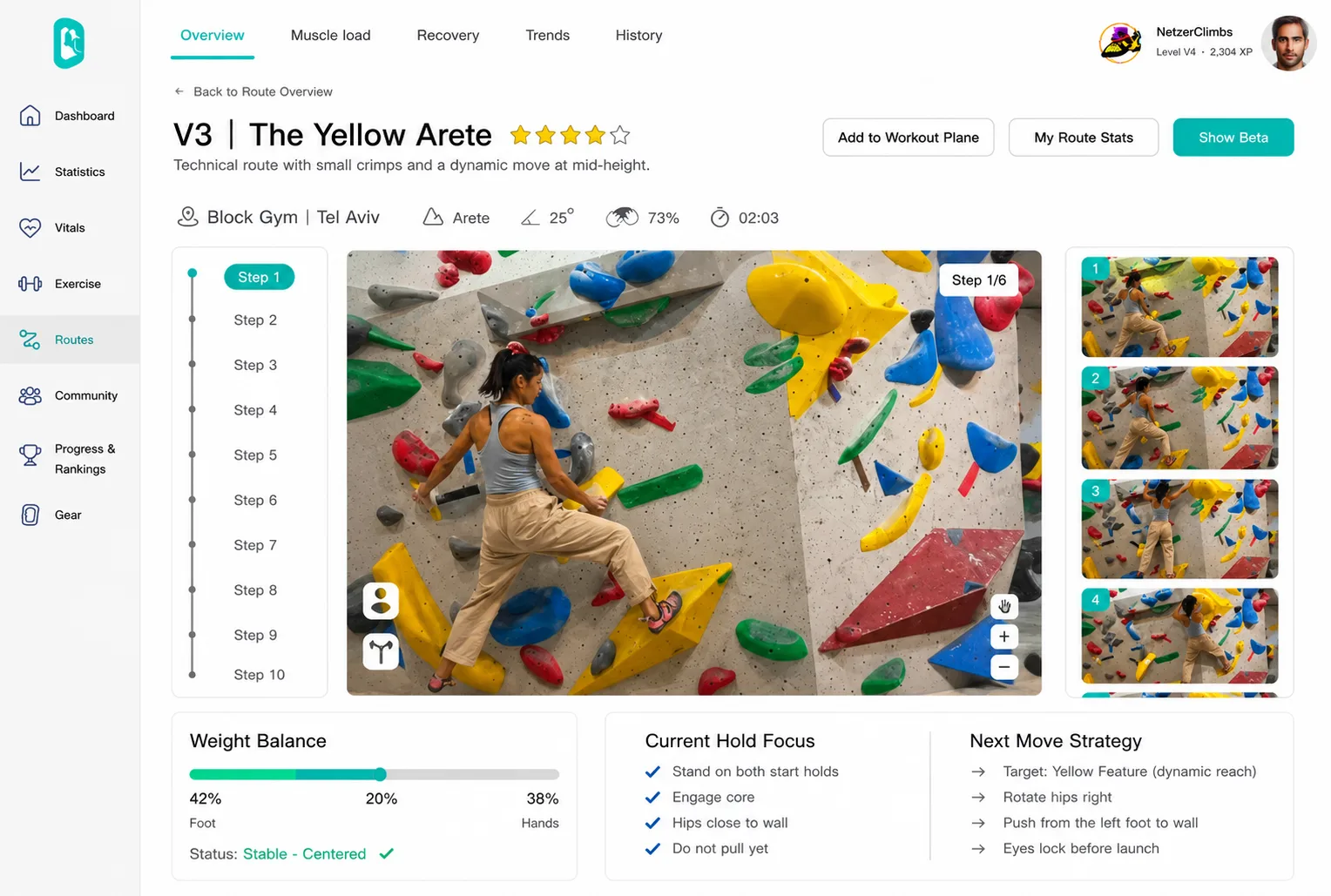
BEFORE Beta – a ten-step rail with captions
FIG.05Steps 1–10 in a left rail, a photo in the middle, and the explanation in three lists underneath it.
The explanation sits below the picture, so your eye has to carry it back up
Weight balance, hold focus and next-move strategy as three separate lists
Nothing here can be read while you are on the wall
AFTER Move by move – drawn on the body
9:56
Attempt
Beta breakdown
Step 4 of 6 · the dynamic reach
Hips further from the wall than at set-up
Next hold · up and right
Step 4 / 6
At the moment you launched
Hips higher and further from the wall than when you set up for the move. Neither foot
moved before the reach began.
Joint positions against the wall plane fixed when you placed the phone
Step 3
Step 5
Compare with the setter's beta
Climb
Problems
Progress
Community
Body
9:55
Problem
Attempt 1 · V4 Red Slab
Fell at move 4 of 6 · 00:38
38 s
Auto-trimmed
What happened
Your hips came away from the wall before the dynamic reach.
Joint positions · scaled to your height
Try this next attempt
Rotate the right hip in and push from the left foot before you launch.
4 / 6
moves
38 s
on the wall
+6
XP
Break down the beta · move by move
Go again
Climb
Problems
Progress
Community
Body
The overlay is drawn on the frame itself, at the joint it is talking about
A dashed cue toward the next hold; labels anchored to the joint they describe
The same clip that sits on Home, opened one level deeper
That is how a person explains climbing: by pointing at the body
What a climber gets now that they did not get before
01
They see themselves
Until now nobody in the gym had ever watched their own climbing. The attempt is filmed, and the move that failed is frozen and drawn on the body.
02
They know what to change
Not “try again”, but one concrete thing for the next attempt – next to the beta of someone who sent this problem at their height.
03
Failure counts
A fall moves readiness, advances challenges and earns XP – and never lowers the rating. The product measures what a climber actually does, not only what worked.
Reflection
What I took from this
The hardest part of this project was not the design. It was admitting that I was not designing a complex system – I was designing a climbing wall. As long as I thought of it as a system, every feature justified itself and the hierarchy only grew. The moment I looked at it through a climber standing in front of a problem, it became obvious what the core feature was and what had simply been there.
And taking a hierarchy apart is harder than building one. Building is adding. Taking apart is deciding what does not go in, and then explaining to myself why.
I also learned not to accept a direction just because someone experienced gave it. The first version was built that way – and that is what took me the longest to undo.
What I take to the next project: a user's real pain is not what they ask for, and not what is convenient for me to solve. It is specific – it happens in a particular place, at a particular moment. Until I understood it, every other decision was an organised guess.
Out of scope, stated openly: setter tools, gym signage and its legal review, and the seller side of the store.


 N
N


 DB
DB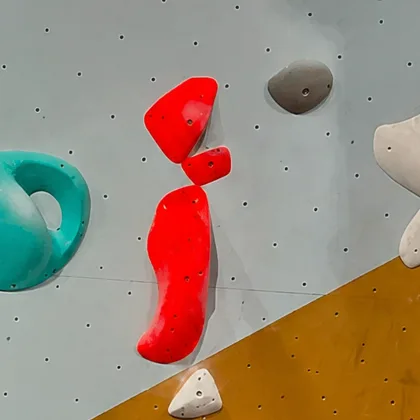

 IK
IK MS
MS SK
SK
 D
D A
A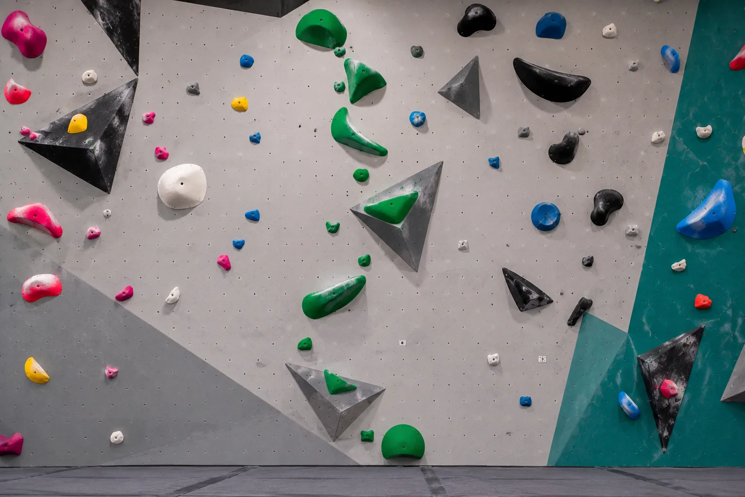
 YR
YR