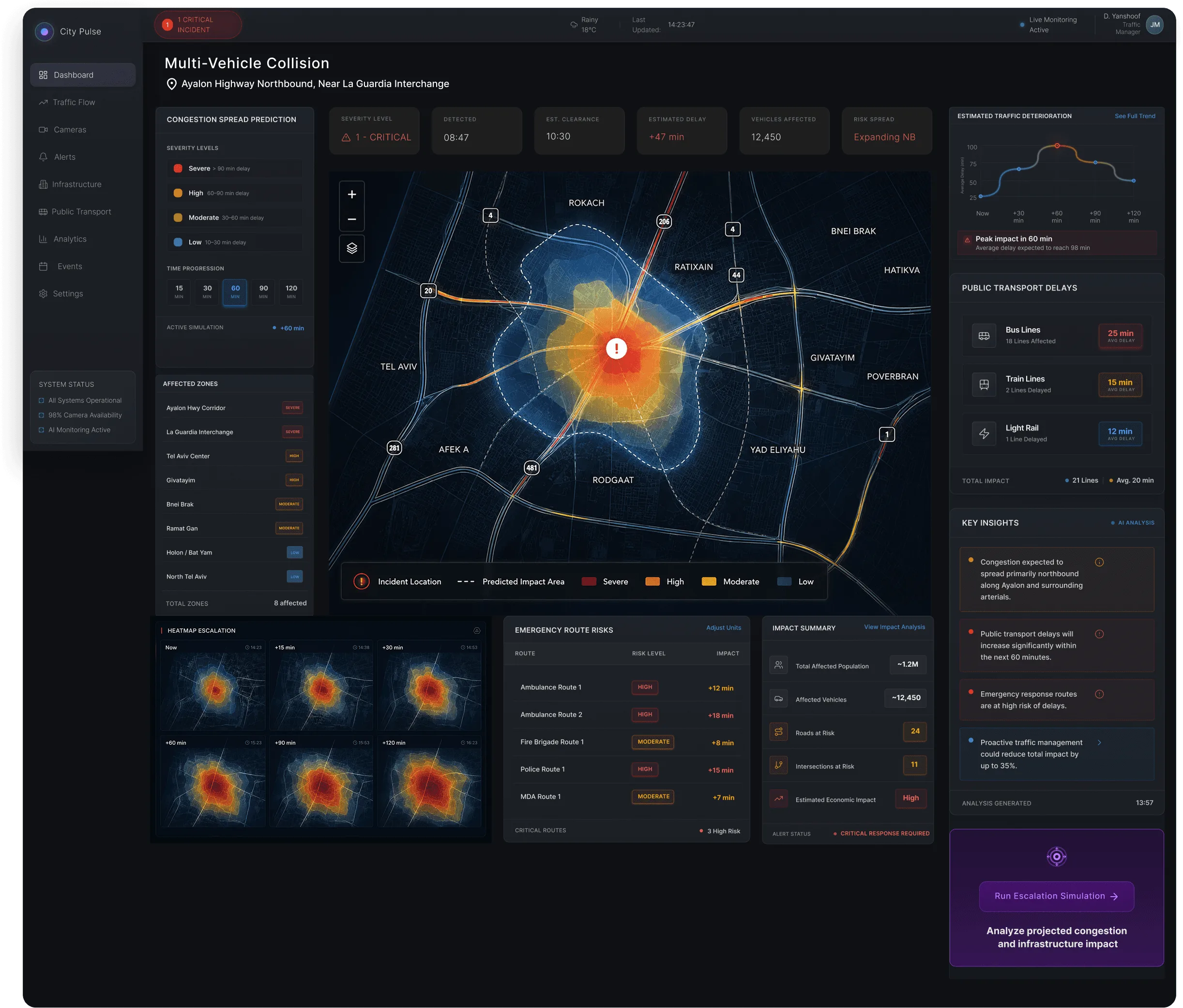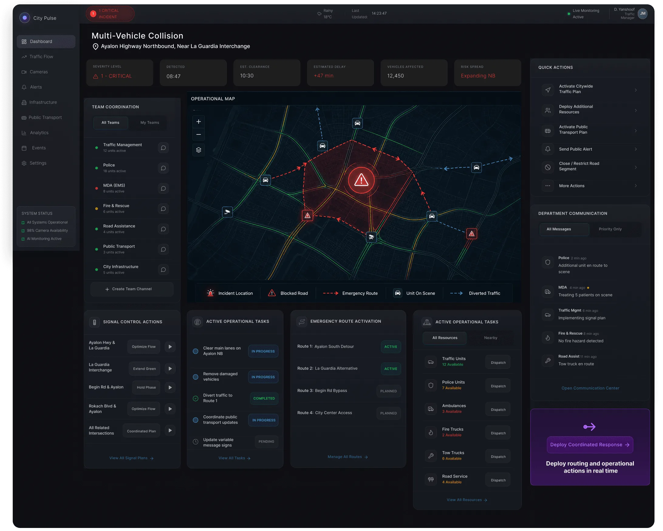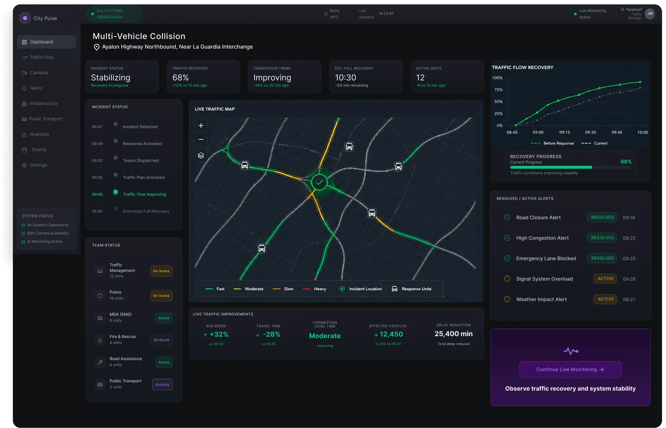
When a city breaks down, operators have minutes — not hours. CityPulse turns fragmented traffic systems into one operational view that detects incidents, predicts their impact, and coordinates the response.

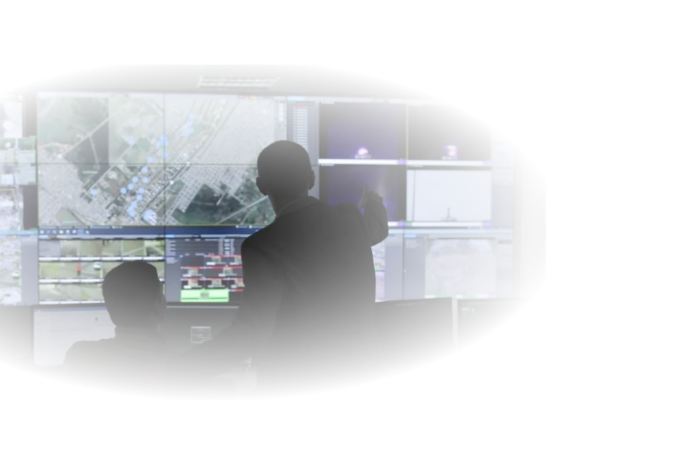
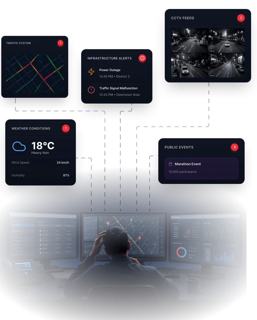
Modern city operators rely on multiple disconnected systems to monitor traffic, infrastructure, public events, and emergencies. Critical information is scattered across dashboards — forcing operators to switch tools, manually connect data points, and make high-stakes decisions under pressure.
Municipal traffic operators carry the shift — they are watching when it starts. Emergency response teams inherit whatever the operator did or did not catch, minutes later and with less context. Both need the same thing at the same moment: one view of what is happening, and what to do about it.
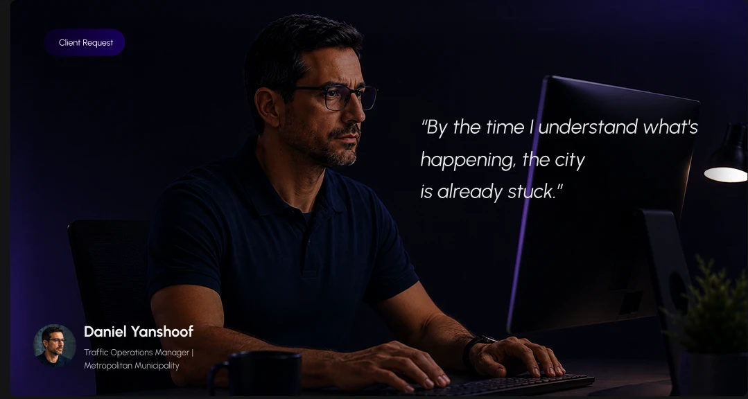
“By the time I understand what’s happening, the city is already stuck.”


Tools that don't communicate with each other.
Critical data spread across screens and dashboards.
Events detected late because visibility is fragmented.
Time lost understanding the situation before acting.
Every delay compounds disruption across the city.

“Operators don't need more data.The insight that shaped every design decision
They need operational clarity.”
I analyzed operator workflows, traffic-management processes, and emergency-response scenarios to identify where the real operational friction lives.
Operators rely on multiple disconnected tools to understand a single incident — slowing decisions and multiplying context switching.
Disruptions spread across city zones faster than operators can manually detect, assess, and coordinate a response.
Platforms surface enormous amounts of data but give almost no guidance on what should happen next.
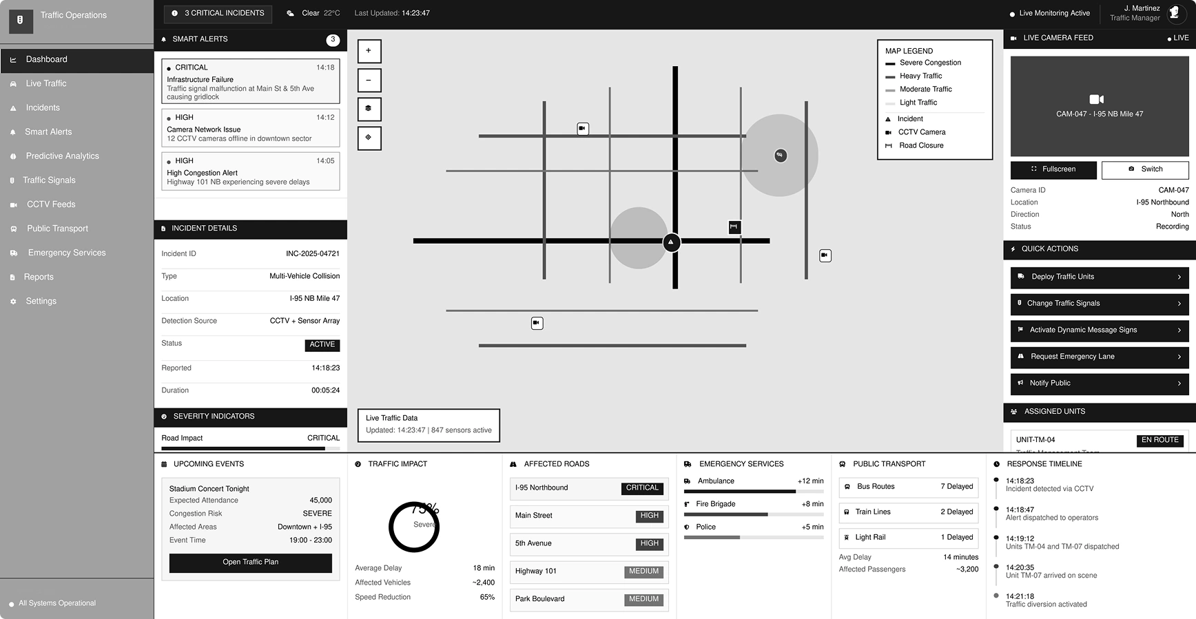
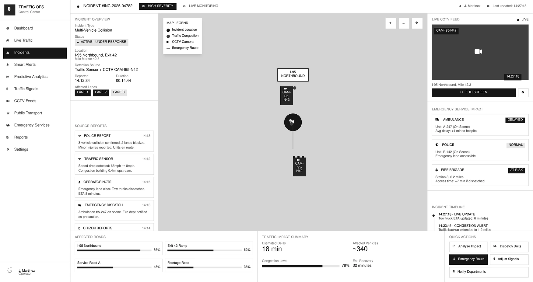
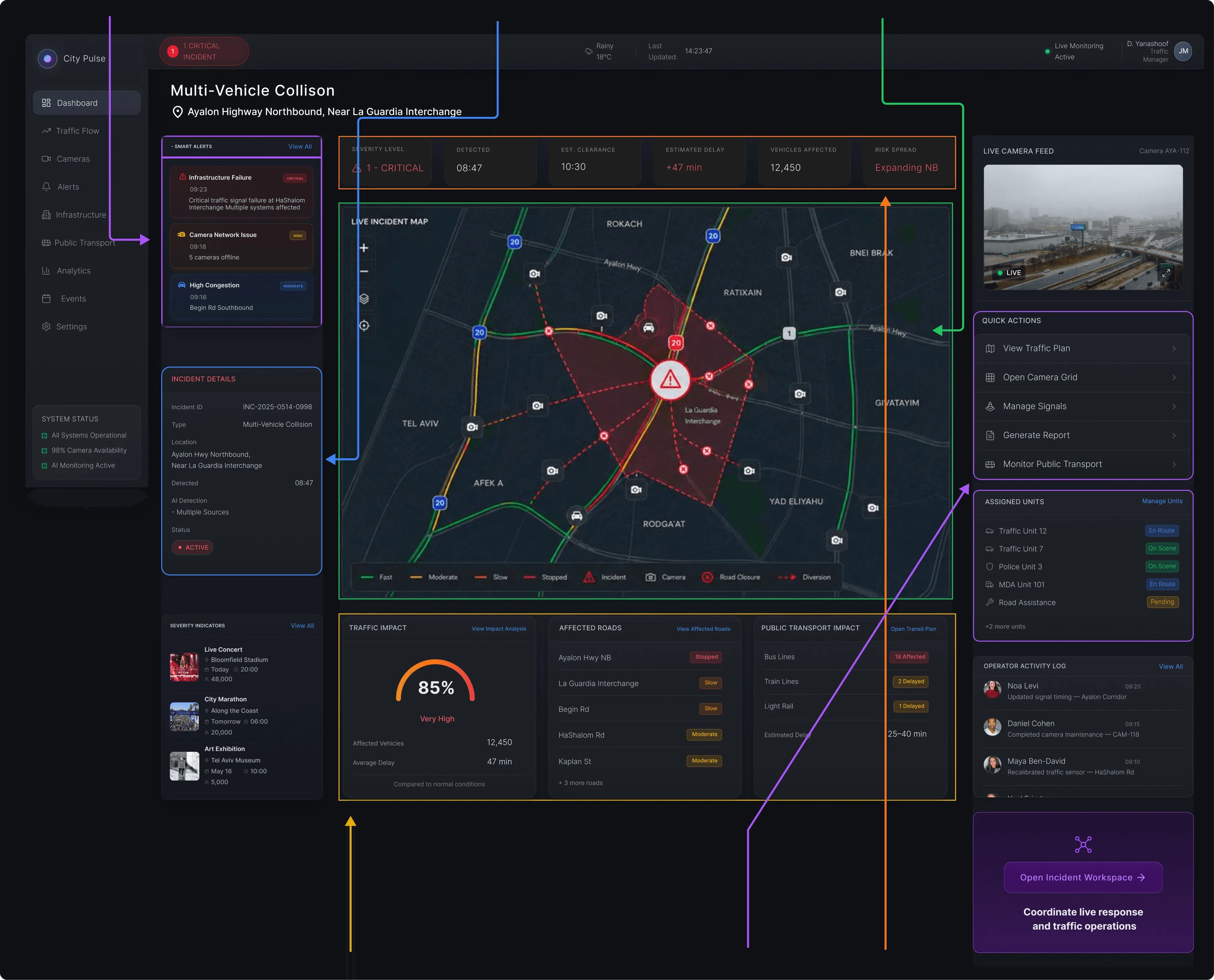
Every element was placed intentionally — to support operator workflows, reduce cognitive load, and speed up decisions during critical incidents.
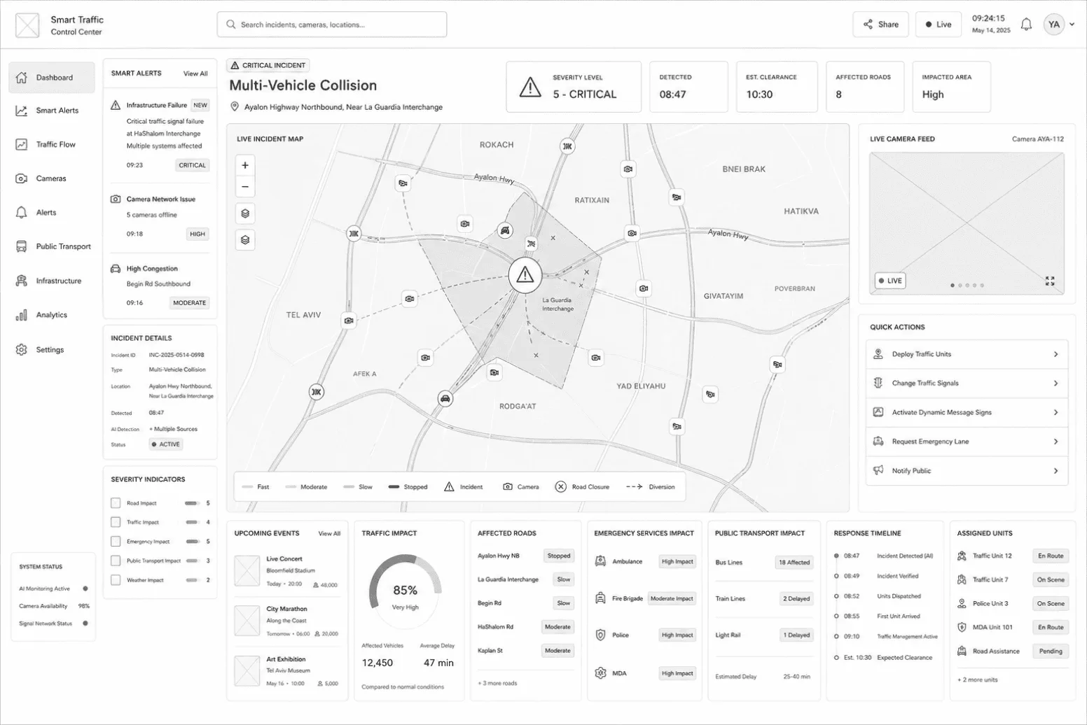
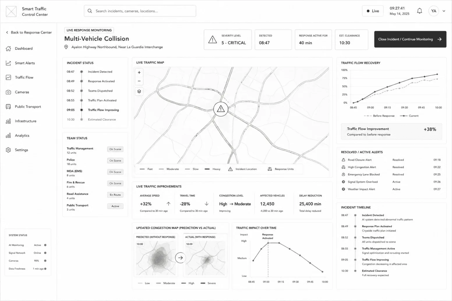
Five low-fidelity studies of the control-centre layout — each testing a different operational moment.


Alerts stay visible at all times, so operators spot new incidents without leaving the workspace.
Always-on awarenessDetails directly beneath alerts create a natural flow from detection to understanding.
Context in one glanceIncident management is fundamentally spatial — so the map is the primary workspace.
See first, decide faster
Critical metrics grouped in a single scan line for instant situational awareness.
Scan in secondsQuick actions, assigned units, and activity logs grouped to support response workflows.
Act without distractionImpact metrics stay close to the map so consequences connect immediately with location.
Understand the impact↑ The top KPI strip: everything an operator needs to grasp the situation, in one scan line.
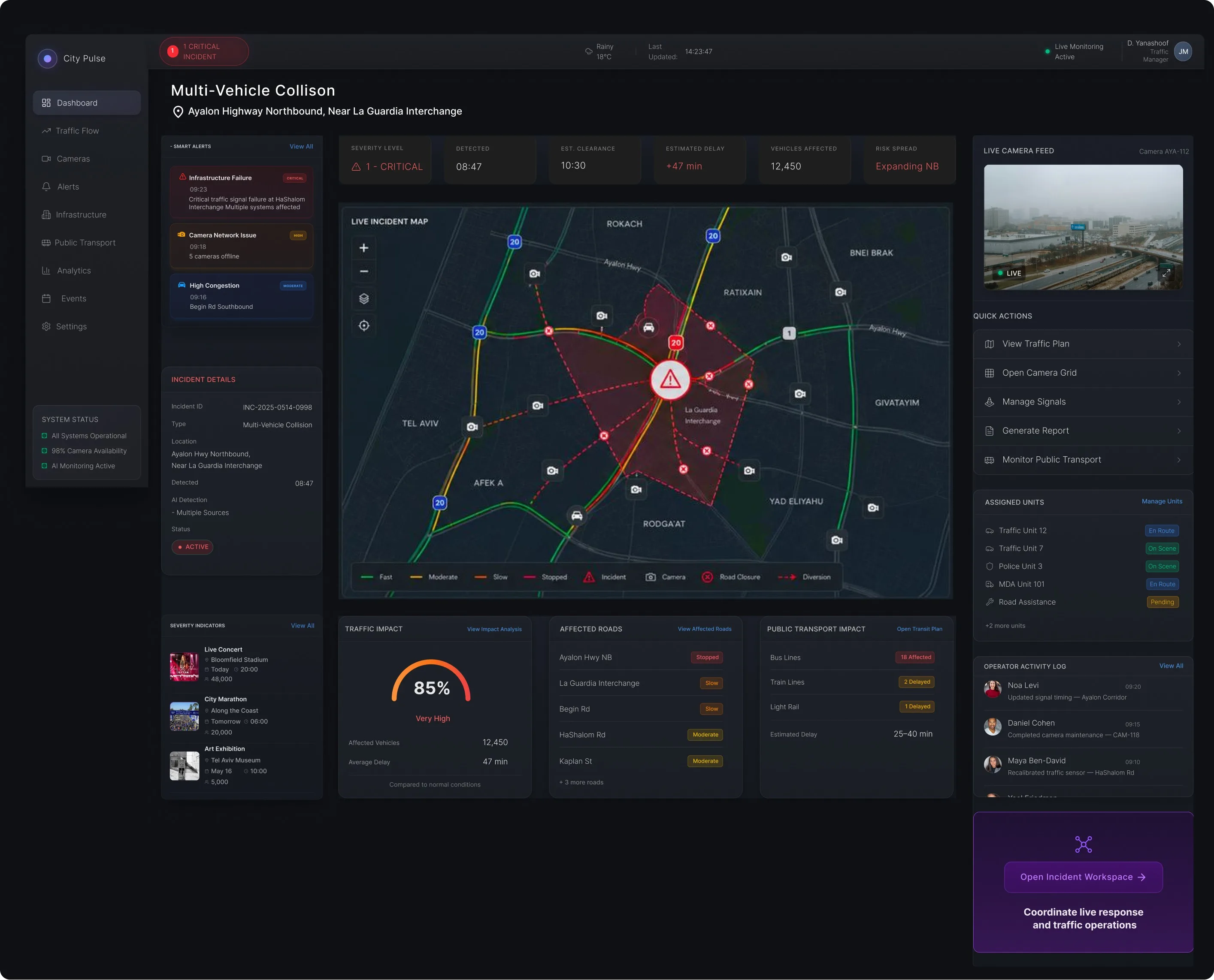
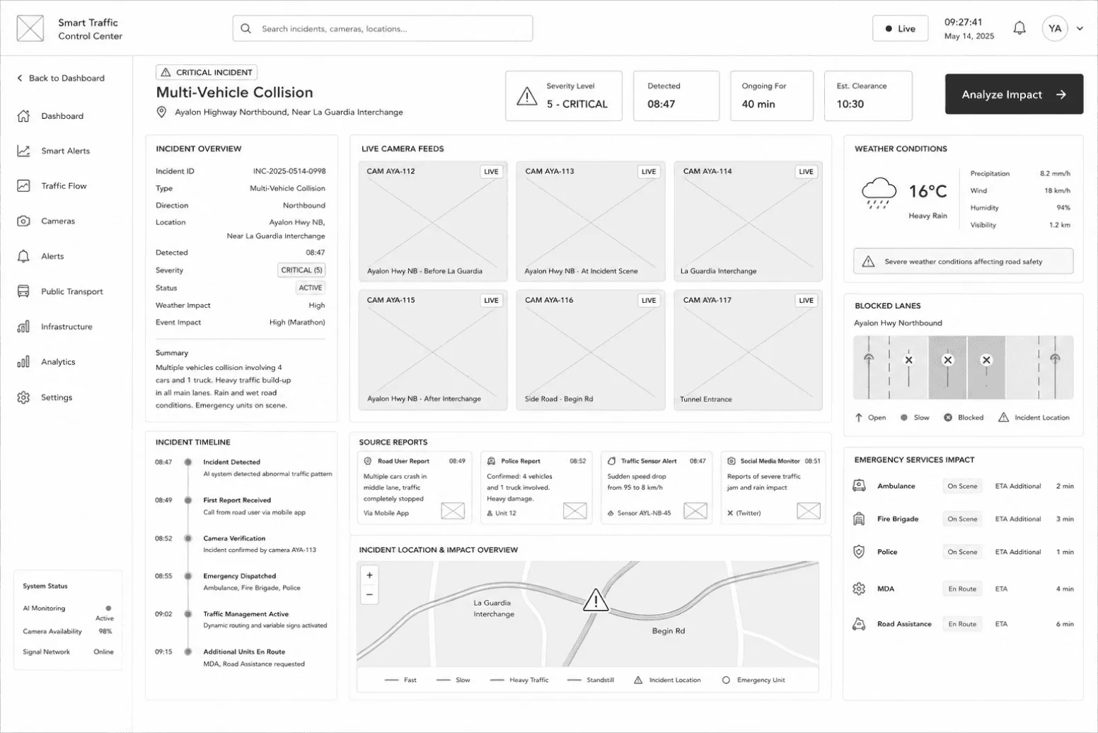
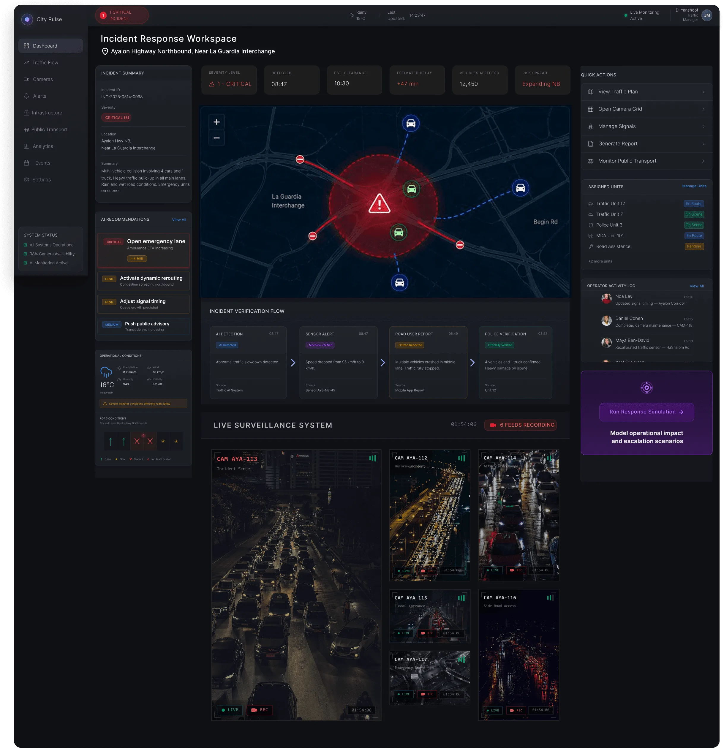
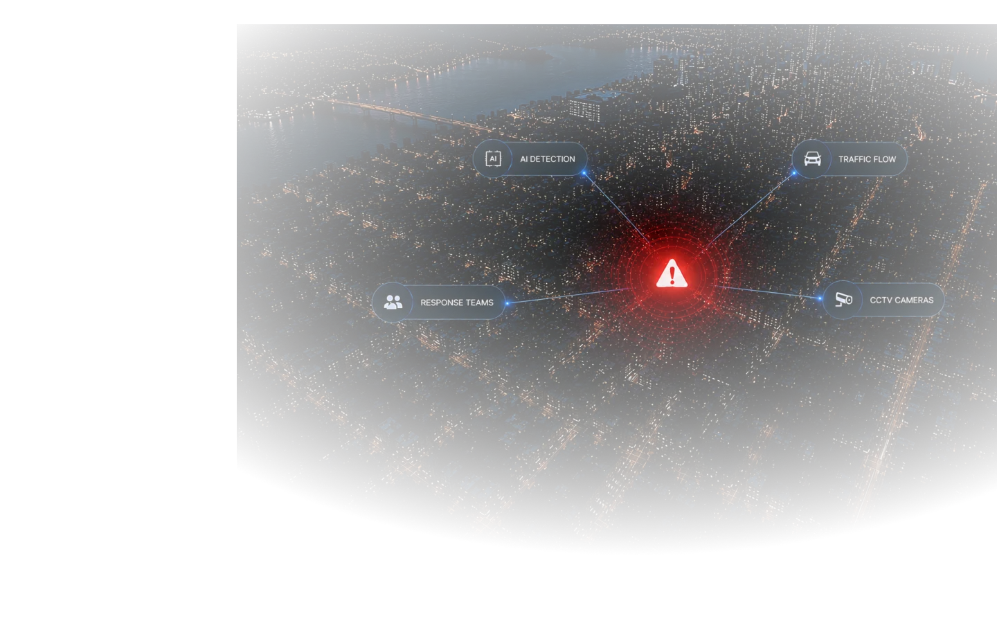
CityPulse identifies abnormal traffic behavior, verifies it across independent sources, predicts escalation, and coordinates the response — in a single operational view.
Abnormal traffic slowdown detected.
Multiple vehicles crashed in middle lane. Traffic fully stopped.
Speed dropped from 95 km/h to 8 km/h.
4 vehicles and 1 truck confirmed. Heavy damage on scene.

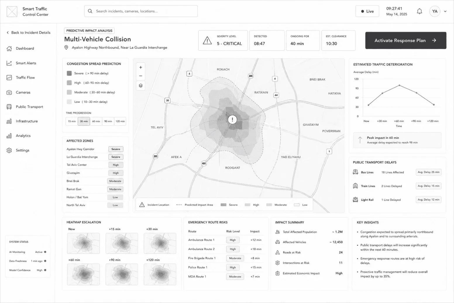
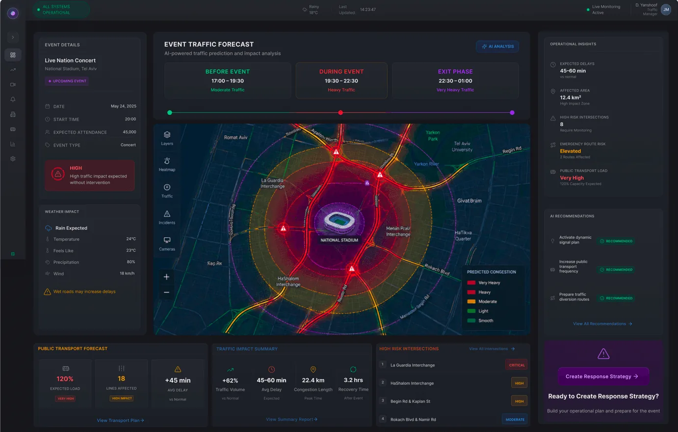
For high-impact city events — a concert, a marathon, a storm, a power outage — CityPulse forecasts congestion, flags infrastructure risk, and recommends action before disruption spreads.

A dark, low-glare interface built for 24/7 control rooms. Color is reserved for meaning — severity, status, and action — so nothing competes with a critical alert.
Weights 300–700 · Icons: Lucide — Alert · Car · Chart · Map · Users · Bell · CPU · Building
Essential data at the forefront. No clutter.
Group related info. Hierarchy guides focus.
Show implications. Help teams act with confidence.
Show relationships. Connect cause to effect.
Every view drives action. Clear next steps.
The workspace is assembled from a small set of components that reappear across every screen. Three groups carry the load: alerting, impact, and response.
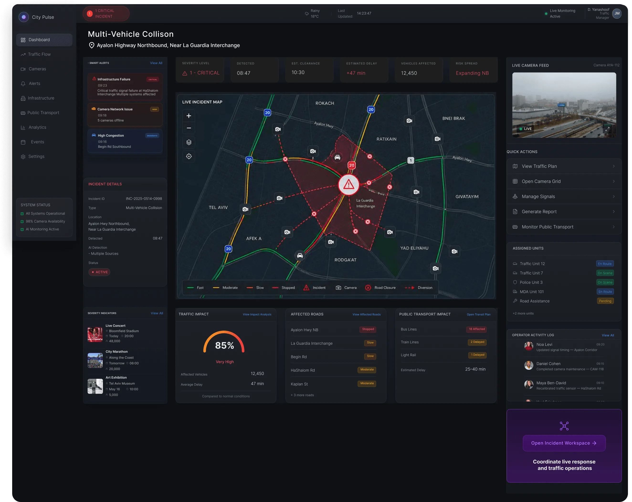
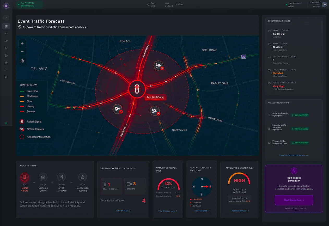
A signal failure at HaShalom Interchange surfaces simultaneously in the top bar, the KPI strip, and the alert rail. Same event, three levels of depth — the operator chooses how far to look.
Incidents ordered by severity with a coloured left edge and a status pill. Critical, high, moderate — the hierarchy is readable peripherally, so a new alert registers without stealing focus from the map.
The badge is a standing answer to "is anything wrong right now"; the tile turns that into a severity an operator can act on. Both use red for one meaning only — critical — so the colour never dilutes.
An 85% traffic-impact arc, 12,450 affected vehicles, and 18 affected bus lines. The cluster answers the question that follows detection — how bad is this going to get — before the operator has to ask it.
Delay and spread direction sit above the detail panels because they decide whether this stays a local incident or becomes a city-wide one.
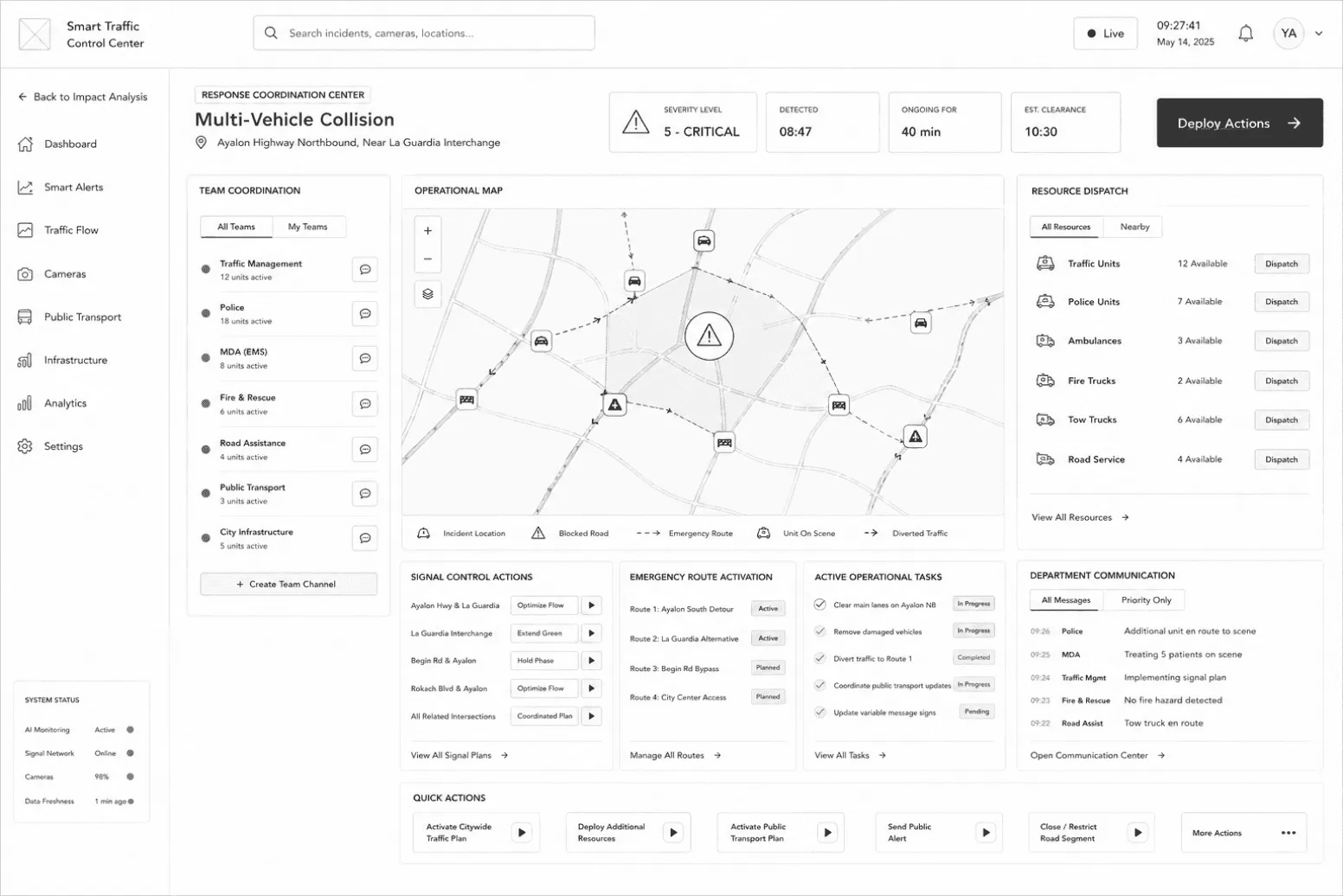
Quick actions, the operator activity log, and assigned units sit together beneath the map. Grouping them means responding never requires leaving the incident.
En route, on scene, pending — five units and their states in one column, so coordination is a glance rather than a phone call.
A single emphasised control opens the incident workspace. Every other action on screen is secondary by construction.
Before: operators spend time understanding the situation.
After: operators spend time solving it.
This project challenged me to think beyond screens and approach traffic management as a real-time operational system. Through AI-assisted monitoring, predictive analysis, and incident-focused workflows, I explored how design helps city teams respond faster, stay coordinated, and make clearer decisions under pressure.
Next steps: validating the concept with real municipal operators, defining success metrics (time-to-detection, time-to-response), and an accessibility pass for 24/7 control-room conditions.