SMART PANTRY COOKING APP
OVERVIEW :
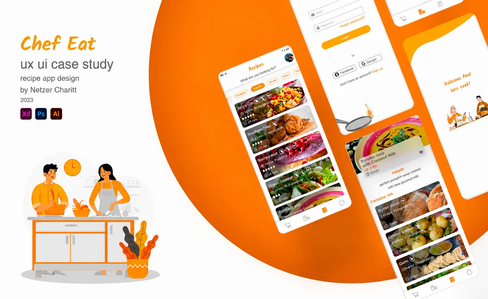
This project is a recipe app presented as a final thesis in the UX UI course at Hakeru Academy.
The assignment is to think about personal pain points from the students' daily lives, manage preliminary research and design an app that solves the pain point that the student came up with.
Chef eat offers recipes that are based on the user's refrigerator and pantry and allow them to work freely without touching their smartphone.
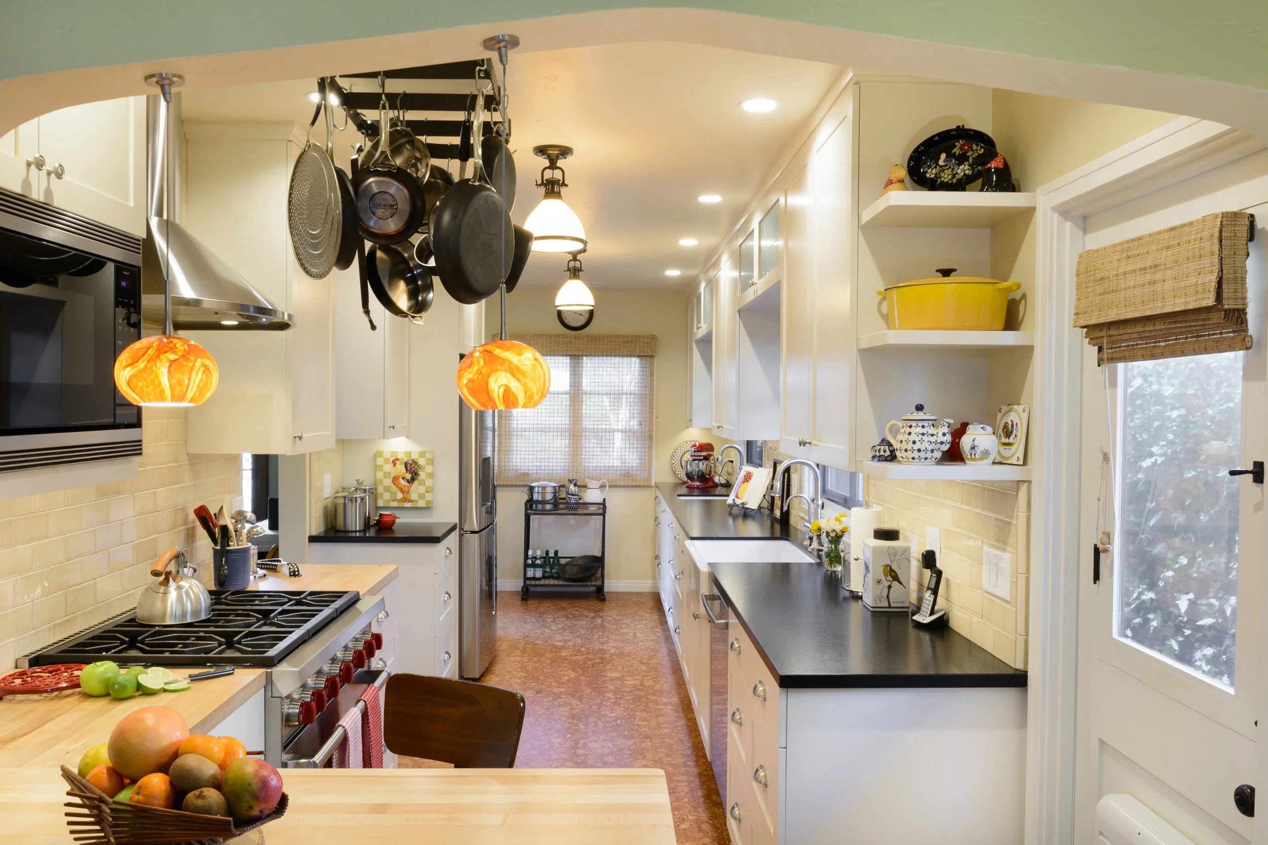
PROBLEM:
Usability
A lot of people don't know how to combine a product in more than one recipe.
Inconvenient Use
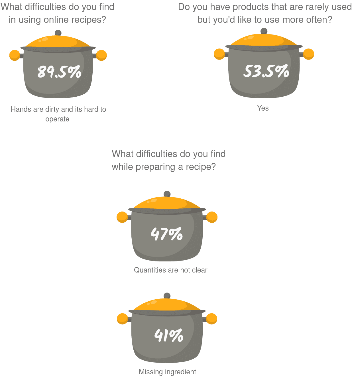
Hands get dirty during recipe preparation and users have difficulties with:
- Unlock the screen
- Scroll through the recipe instructions
Quantities and Servings
Users don't know how to adjust quantities and don't have the right benchmark.
Filter
Users search for recipes in several parameters such as time, cook difficulty, vegan, cuisine type, replaceable ingredients, and they have difficulty to find the right recipe that suits their needs.
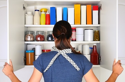
SOLUTION:
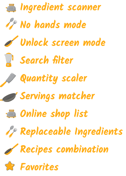
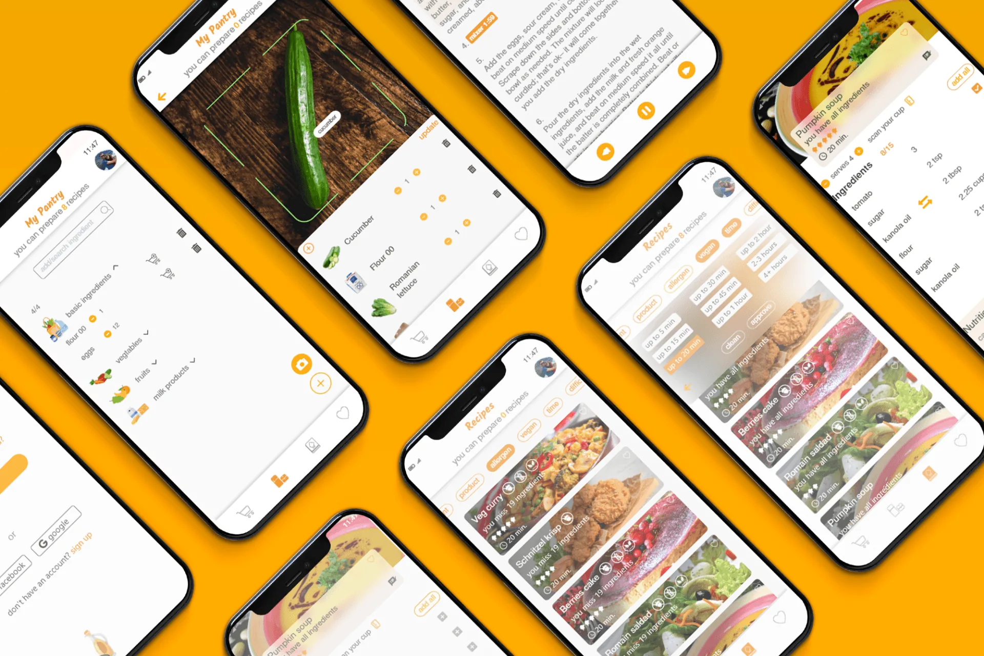
Camera Scan
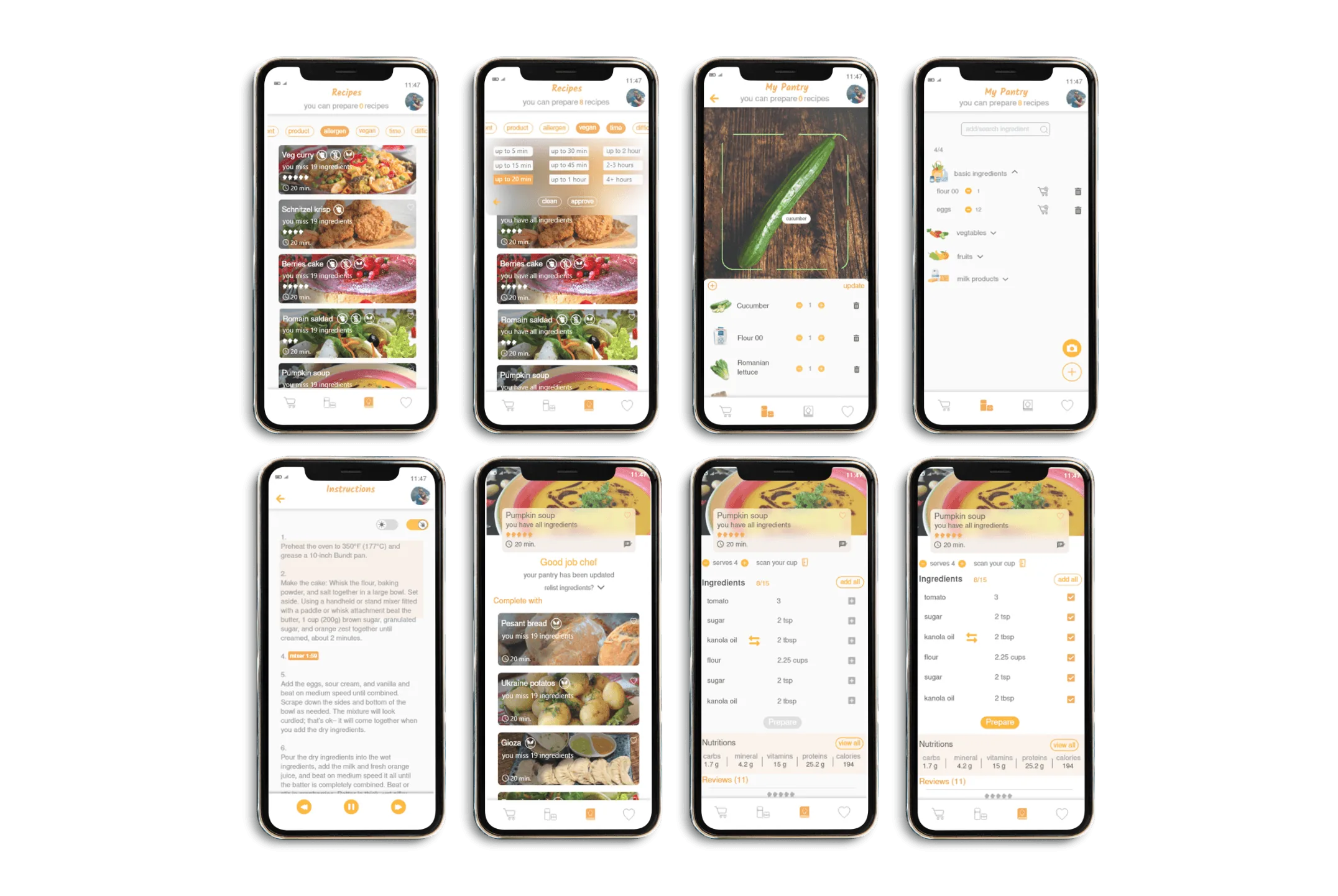
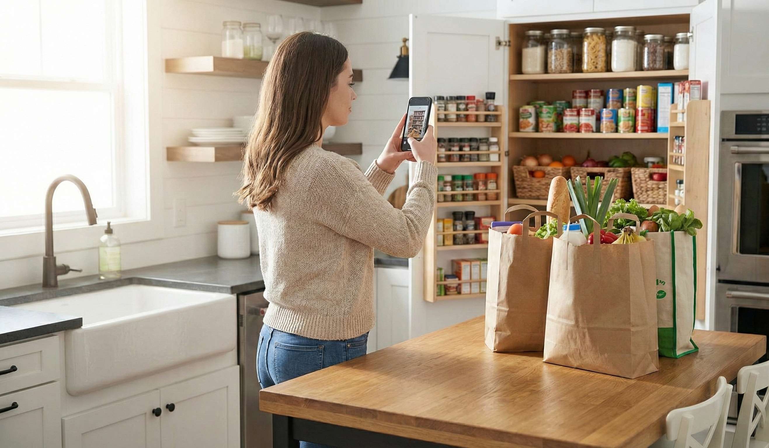
Users use their phone's camera to upload products to the app and the app offers them suitable recipes.
Voice Command
Users can use voice commands to scroll upwards and downwards without touching the smartphone.
Screen Lock
An in-app button that controls the smartphone screen lock.
Cup scan and servings matching
Features that allow users to set the number of servings and calculate the quantities of the recipe and they can also scan their existing cup to understand the measurements.
Smart Filter
That offers users several options to find the right recipe for them.
PROCESS
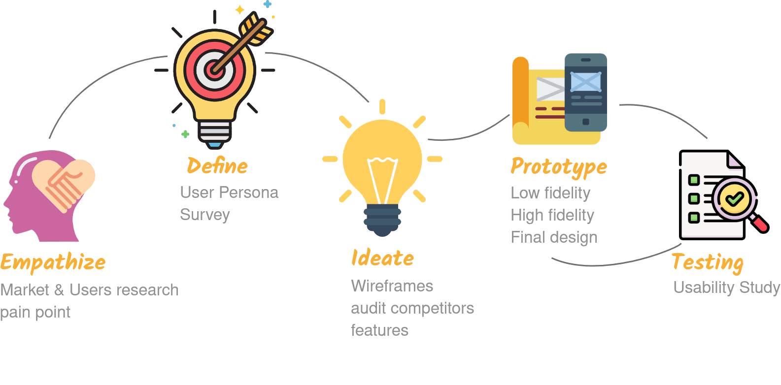
SURVEY
FEATURES
PERSONA
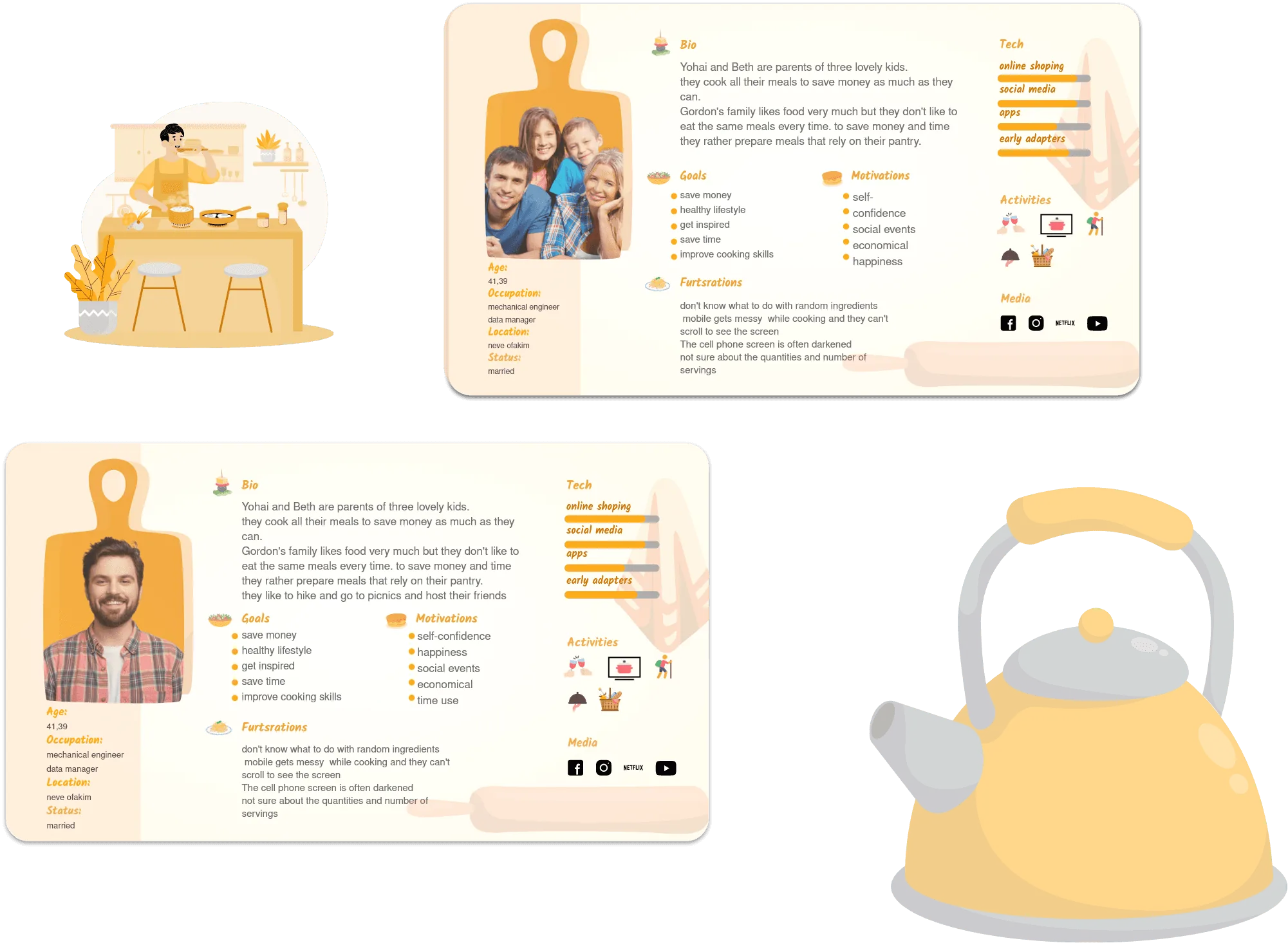
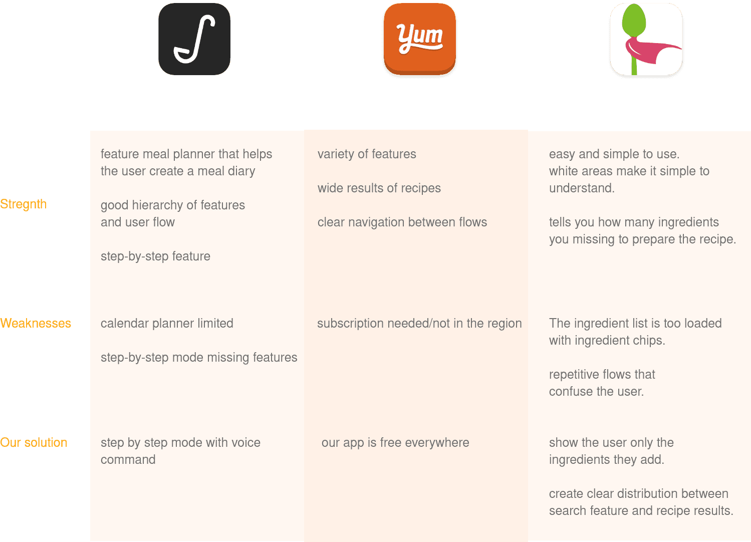
COMPETITORS AUDIT
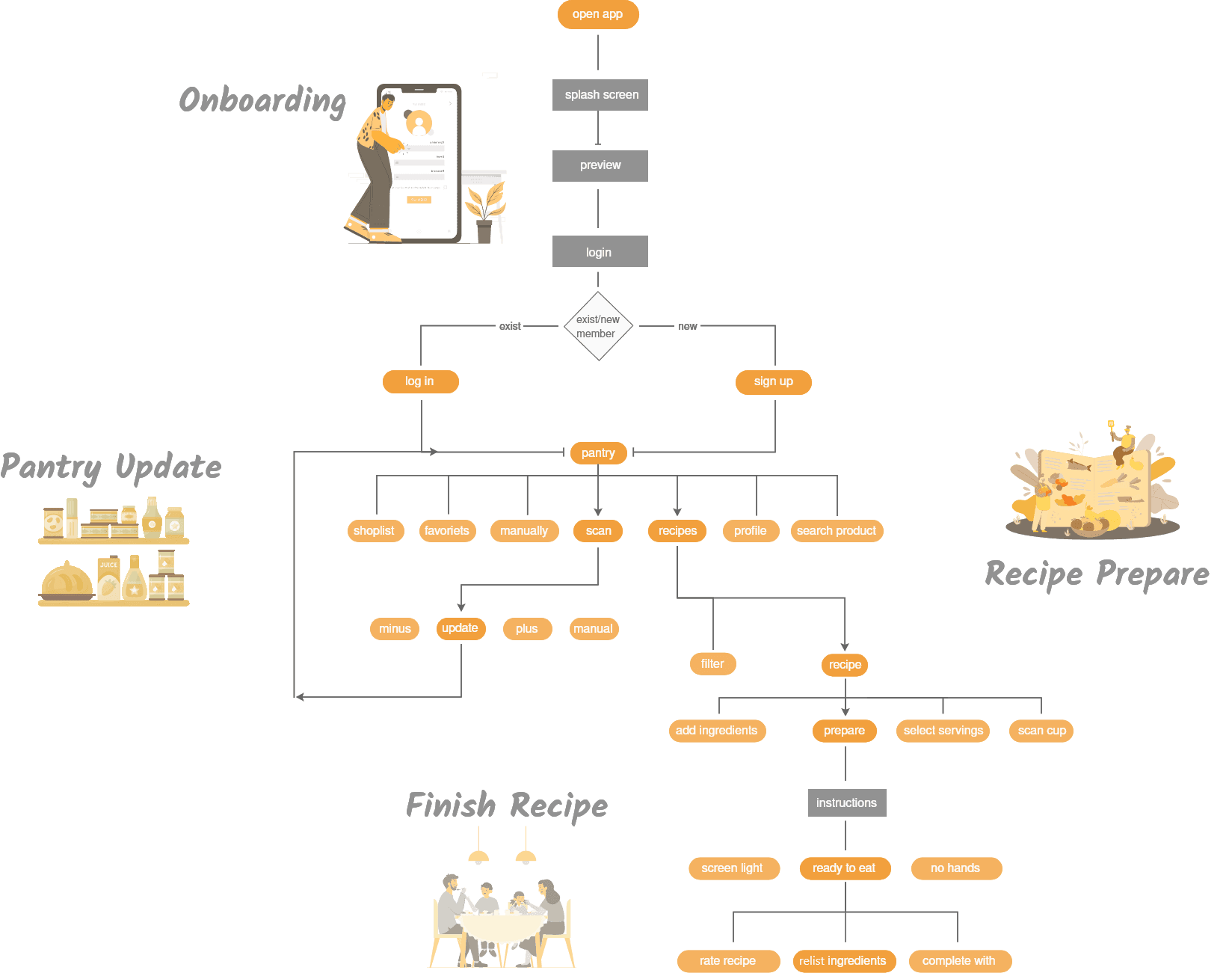
USER FLOW
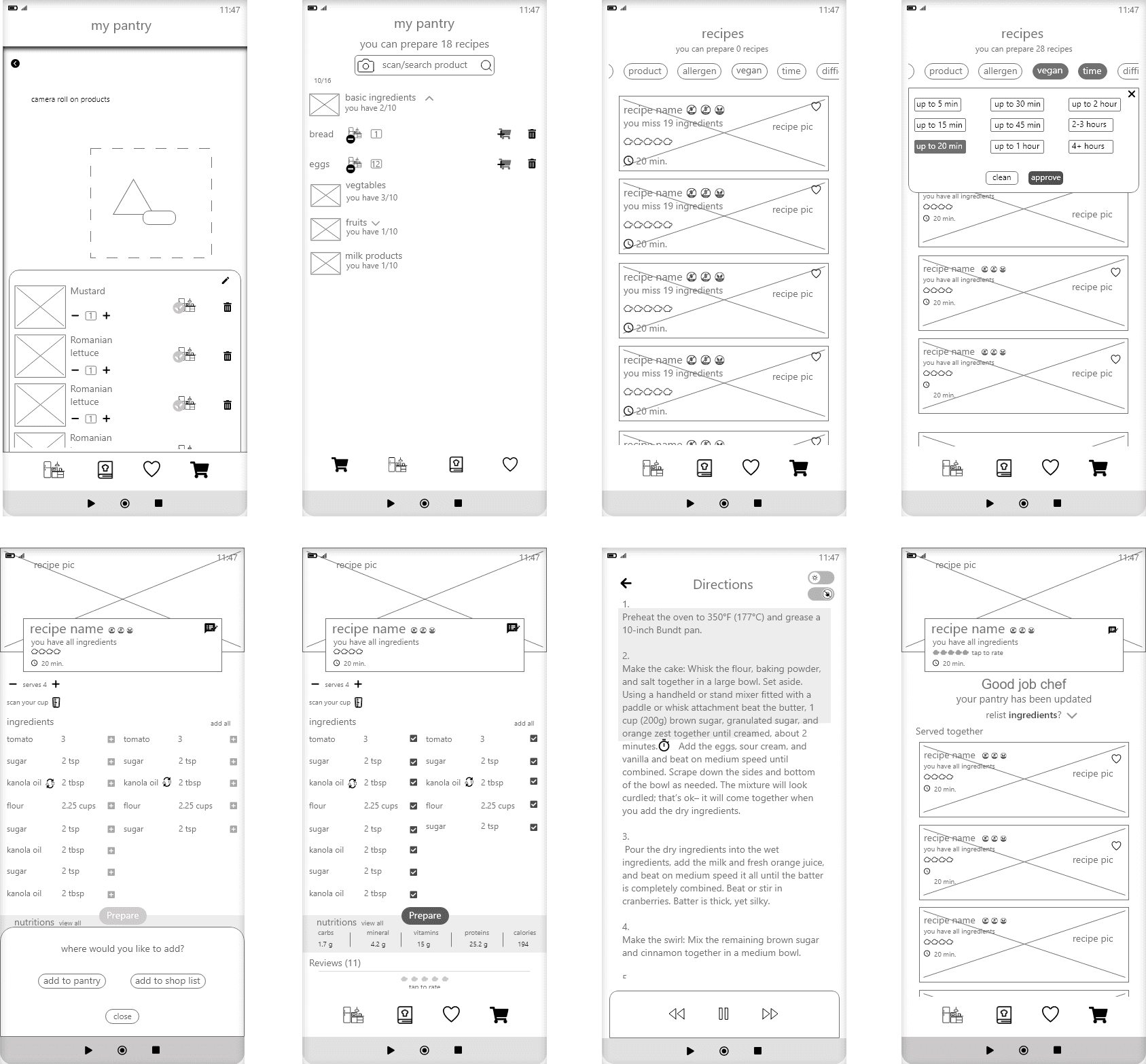
LOW FIDELITY
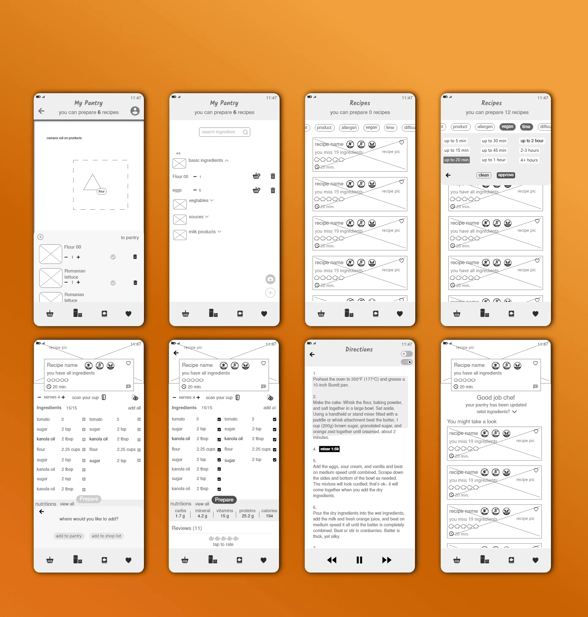
HIGH FIDELITY
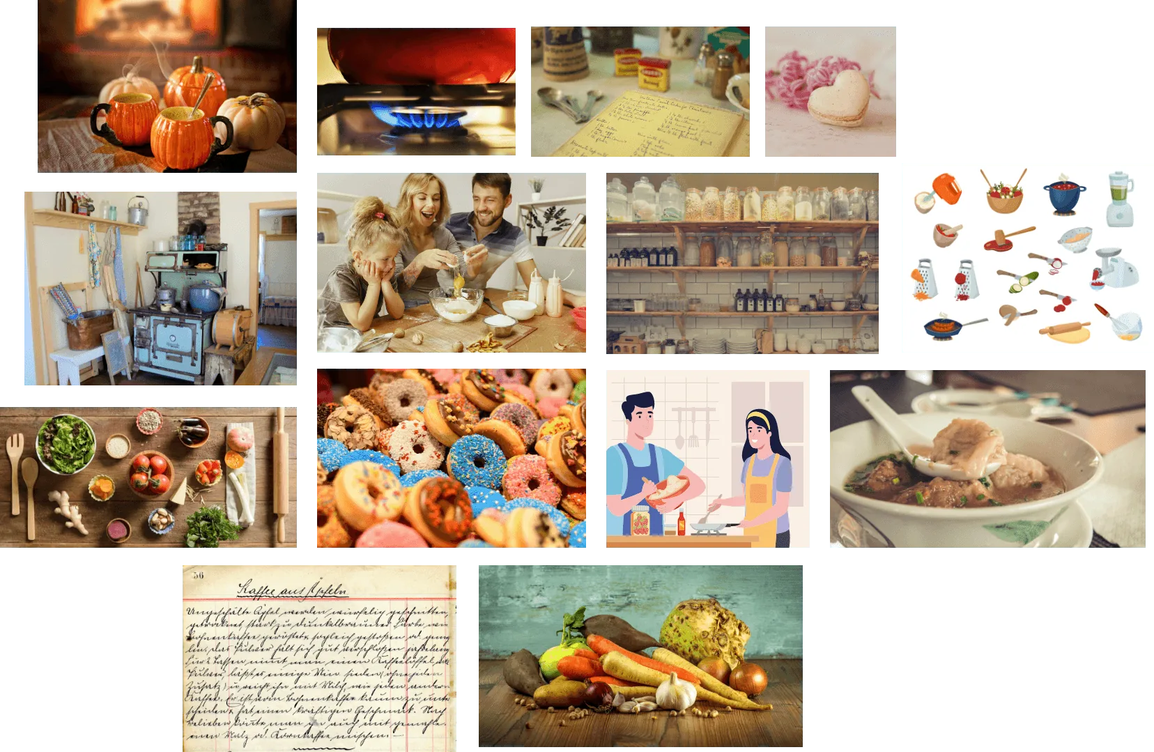
MOOD BOARD
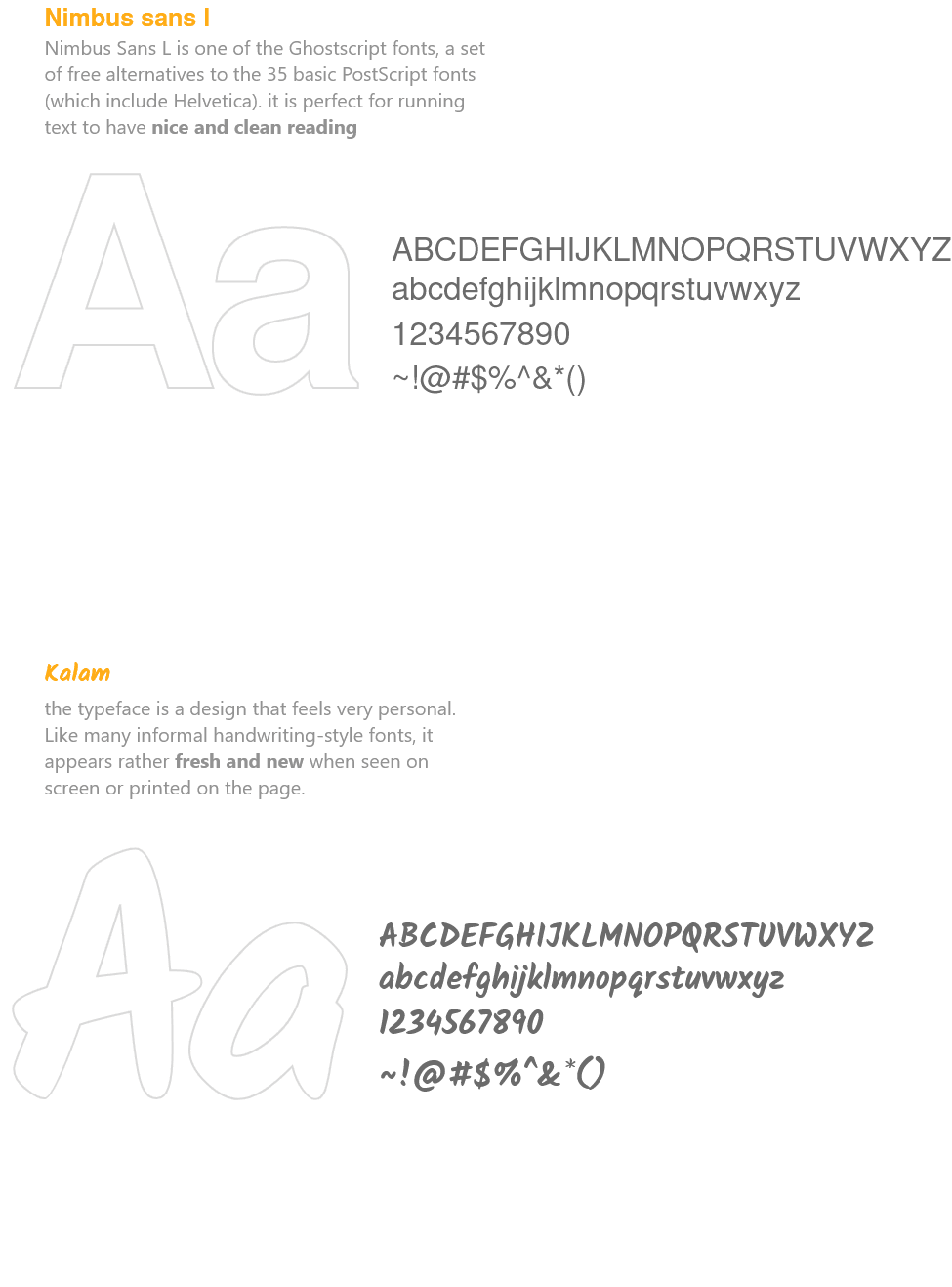
TYPOGRAPHY
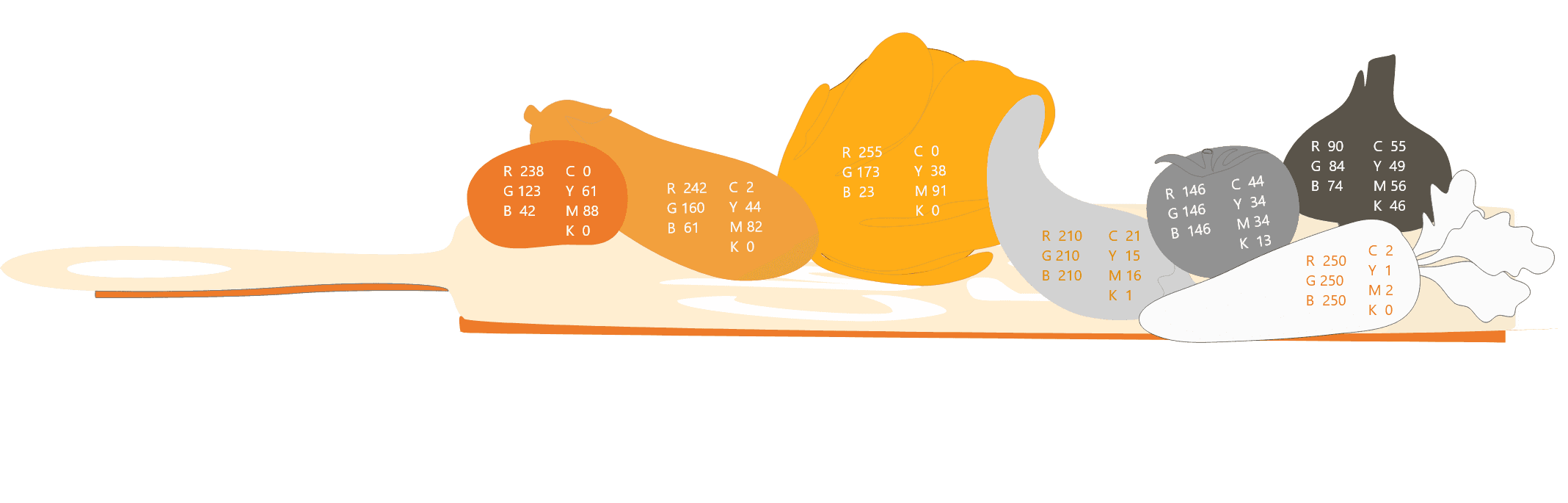
COLOR
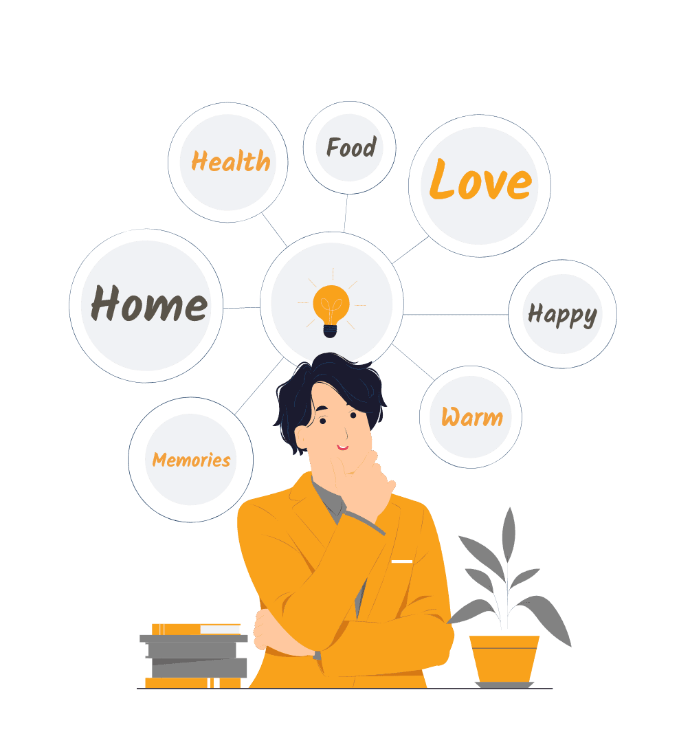
As part of the mind map, we gathered images and took a color sample.
Finally, we decided to pick orange, which is a mouth-watering color and also a symbol of health and happiness.
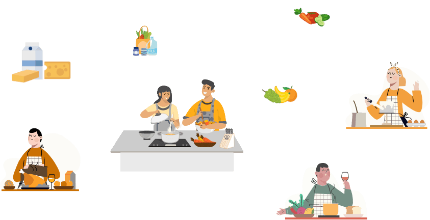
Illustrations
As part of the graphic language, the illustration bolding the personal message. In its fun way, it helps to deliver fast the story we want to tell.
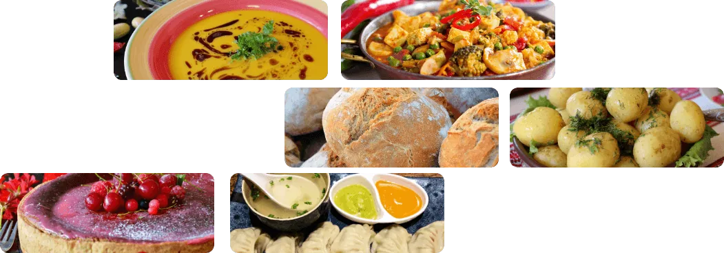
Recipe images
Colorful and rich images in hi quality to provide the flavors and fragrances.
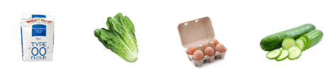
Ingredient images
Divided from any other object on a white background to increase the user's self-confidence in the scan mode.
ICONS
Rounded corners and shapes to continue the rounded graphic language.

LOGO
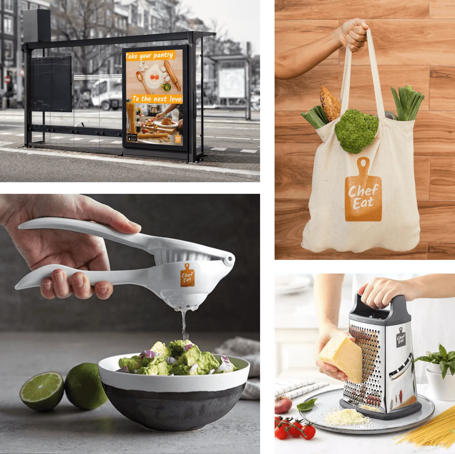
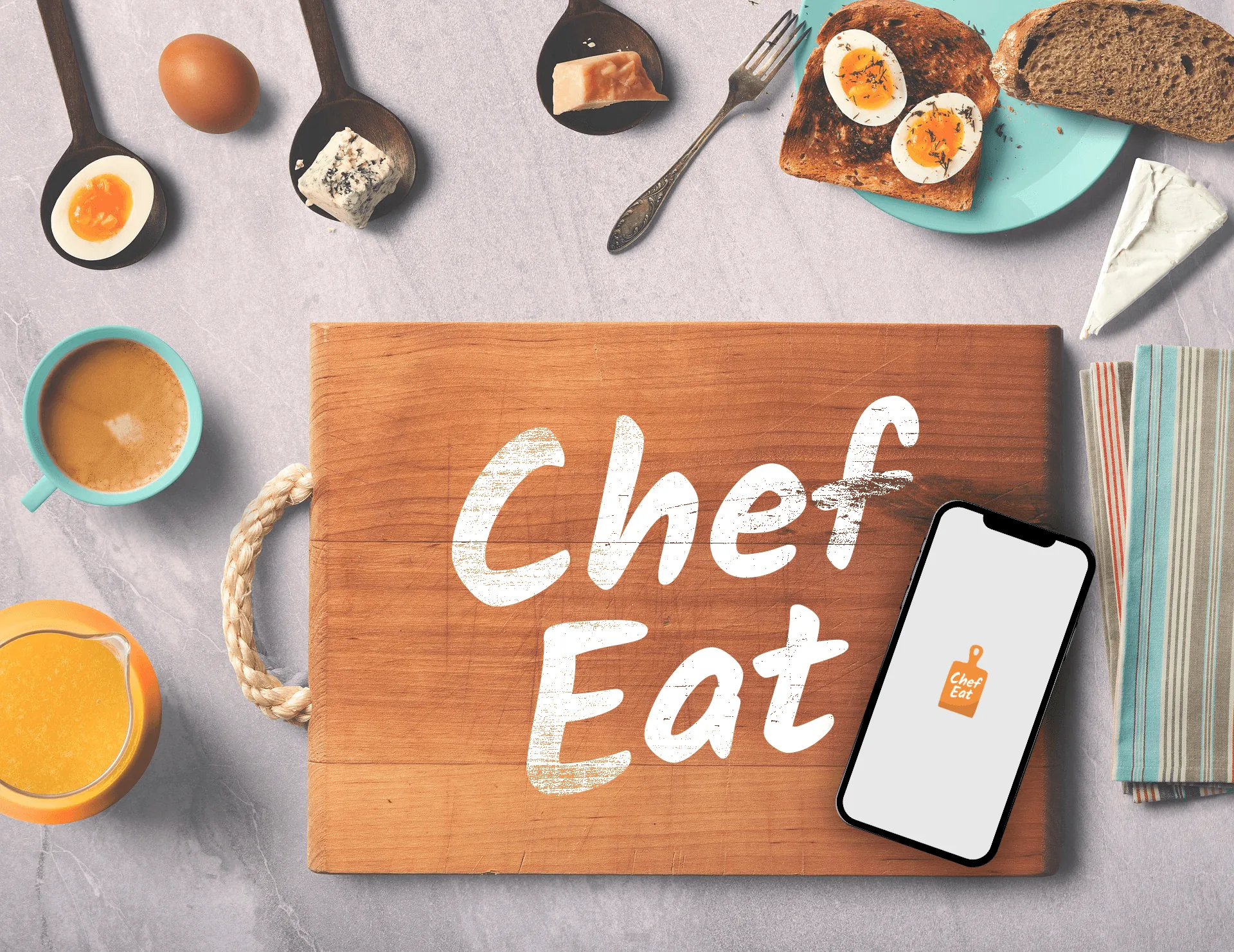
Cutting board illustration combined with the hand-write font to provide the personal message. Together with the orange color which holds the mind map words, we came up with this final logo design.